|
|

Headings
To create a header, place "hn. " at the start of the line (where n can be a number from 1-6).
| Notation |
Comment |
| h1. Biggest heading |
Biggest heading
|
| h2. Bigger heading |
Bigger heading
|
| h3. Big Heading |
Big Heading
|
| h4. Normal Heading |
Normal Heading
|
| h5. Small Heading |
Small Heading
|
| h6. Smallest Heading |
Smallest Heading
|
Text Effects
Text effects are used to change the formatting of words and sentences.
| Notation |
Comment |
| *strong* |
Makes text strong.
|
| _emphasis_ |
Makes text emphasis.
|
| ??citation?? |
Makes text in citation.
|
| -strikethrough- |
Makes text as strikethrough.
|
| +underlined+ |
Makes text as underlined.
|
| ^superscript^ |
Makes text in superscript.
|
| ~subscript~ |
Makes text in subscript.
|
| {{text will be monospaced}} |
Makes text as code text.
|
| bq. Some block quoted text |
To make an entire paragraph into a block quotation, place "bq. " before it.
Example:
Some block quoted text
|
{quote}
here is quoteable
content to be quoted
{quote}
|
Quote a block of text that's longer than one paragraph.
Example: here is quoteable
content to be quoted
|
{color:red}
look ma, red text!
{color}
|
Changes the color of a block of text.
Example:
look ma, red text!
|
Text Breaks
Most of the time, explicit paragraph breaks are not required - Confluence will be able to paginate your paragraphs properly.
| Notation |
Comment |
| (empty line) |
Produces a new paragraph |
| \\ |
Creates a line break. Not often needed, most of the time Confluence will guess new lines for you appropriately. |
| ---- |
creates a horizontal ruler |
| --- |
Produces — symbol. |
| -- |
Produces – symbol. |
Links
Links are the heart of Confluence, so learning how to create them quickly is important.
| Notation |
Comment |
[#anchor]
[^attachment.ext]
or
[pagetitle]
[pagetitle#anchor]
[pagetitle^attachment.ext]
or
[spacekey:pagetitle]
[spacekey:pagetitle#anchor]
[spacekey:pagetitle^attachment.ext]
|
Creates an internal hyperlink to the specified page in the desired space (or the current one if you don't specify any space). Appending the optional '#' sign followed by an anchor name will lead into a specific bookmarked point of the desired page. Also having the optional '^' followed by the name of an attachment will lead into a link to the attachment of the desired page.
Example:
pagetitle
If such a page doesn't already exist, it will allow you to create the page in the current space. Create page links will have a  after them. after them.
Example:
anewpage
|
[link alias|#anchor|link tip]
[link alias|^attachment.ext|link tip]
or
[link alias|pagetitle|link tip]
[link alias|pagetitle#anchor|link tip]
[link alias|pagetitle^attachment.ext|link tip]
or
[link alias|spacekey:pagetitle|link tip]
[link alias|spacekey:pagetitle#anchor|link tip]
[link alias|spacekey:pagetitle^attachment.ext|link tip]
|
Creates an internal hyperlink to the specified page in the desired space (or the current one if you don't specify any space) where the link text is different from the actual hyperlink link. Also you can have an optional link tip which will apear as tooltip. Appending the optional '#' sign followed by an anchor name will lead into a specific bookmarked point of the desired page. Also having the optional '^' followed by the name of an attachment will lead into a link to the attachment of the desired page.
Example:
link alias
|
|
[/2004/01/12/Blog Post]
[spacekey:/2004/01/12/Blog Post]
|
Creates an internal hyperlink to the specified blog post in the desired space (or the current one if you don't specify any space). You must specify the date the post was made in /year/month/day form as shown. Anchors and link text can be added the same way as described above. If you attempt to link to a blog post that doesn't exist, no link will be created.
Example:
|
[/2004/01/12]
[spacekey:/2004/01/12]
or
[my link name|/2004/01/12]
[my link name|spacekey:/2004/01/12]
|
Creates an internal hyperlink to a view of a whole day's news. Specify the date you wish to link to as year/month/day. Link titles can be supplied as with other links. It is possible to link to days with no news items on them: the destination page will just be empty.
Examples:
|
[$12345]
or
[my link name|$12345]
|
Creates a link to a piece of content by its internal database ID. This is currently the only way to link to a mail message.
Examples:
|
[spacekey:]
[custom link title|spacekey:]
|
Creates a link to the space homepage, or space summary page of a particular space. Which of these the link points to depends on the configuration of the space being linked to. If the space does not exist, the link will be drawn with a strike-through to indicate it is an invalid space.
Examples:
|
[~username]
[custom link title|~username]
|
Creates a link to the user profile page of a particular user. By default, will be drawn with a user icon and the user's full name, but if you supply a custom link text, the icon will not be drawn. If the user being linked to does not exist, the link will be drawn with a strike-through.
Examples:
|
[phrase@shortcut]
[custom link text|phrase@shortcut] |
Creates a shortcut link to the specified shortcut site. Shortcuts are configured by the site administrator. You can add a link title to shortcuts in the same manner as other links.
Examples:
|
[http://confluence.atlassian.com]
[Atlassian|http://atlassian.com] |
Creates a link to an external resource, special characters that come after the URL and are not part of it must be separated with a space. External links are denoted with an arrow icon.
Note: the [] around external links are optional in the case you do not want to use any alias for the link.
Examples:
|
| [mailto:legendaryservice@atlassian.com] |
Creates a link to an email address, complete with mail icon.
Example:
 legendaryservice@atlassian.com legendaryservice@atlassian.com
|
[file://c:/temp/foo.txt]
[file://z:/file/on/network/share.txt] |
This only works on Internet Explorer
Creates a link to file on your computer or on a network share that you have mapped to a drive
|
|
{doc:/display/DOC/Confluence+Documentation+Home}Confluence Documentation{doc}
|
A macro that allows you to quickly create links to content at http://confluence.atlassian.com.
|
|
{anchor:anchorname}
|
Creates a bookmark anchor inside the page. You can then create links directly to that anchor. So the link [My Page#here] will link to wherever in "My Page" there is an {anchor:here} macro, and the link [#there] will link to wherever in the current page there is an {anchor:there} macro.
|
|
{add-page:template=My Template|parent=Page Parent}Click to add page{add-page}
|
Generates an 'Add Page' link which, when clicked, can take the user directly
to a template and/or set the page parent.
- template - (optional) the name of the template to use when creating the page.
- live - (optional) if set to 'true', the template will be live when the page is created. Defaults to false.
- parent - (optional) the name of the parent page (empty by default).
May also have the following markers:
- @self - (default) the parent will be the page the macro is in.
- @parent - the parent will be the parent of the page the macro is in.
- @home - the parent will be home page for the Space the page is in.
- title - (optional) if you want popup text to appear when the mouse is hovered
over the link, enter it here.
- labels - (optional) the list of labels to apply to the new page. Does not work for non-live templates.
- allowRename - (optional) if set to
true, the user will be allowed to rename the page while it is being created.
|
|
{add-page-form:template=My Template|parent=Page Parent}Click to add new page{add-page-form}
|
Generates an 'Add Page' form with a field for the title.
- template - (optional) the name of the template to use when creating the page.
- live - (optional) if set to 'true', the template will be live when the page is created. Defaults to false.
- parent - (optional) the name of the parent page (empty by default).
May also have the following markers:
- @self - (default) the parent will be the page the macro is in.
- @parent - the parent will be the parent of the page the macro is in.
- @home - the parent will be home page for the Space the page is in.
- labels - (optional) the list of labels to apply to the new page. Does not work for non-live templates.
- allowRename - (optional) if set to
true, the user will be allowed to rename the page while it is being created.
- width - (optional) The width of the title text field. Eg. '250px' or '70%'.
|
{link-page:template=My Template|parent=Page Parent}Click to add page{link-page}
{link-page:Page Title|template=My Template}A Specific Page{link-page}
|
Links to a page in the current space.
If the page doesn't exist or is untitled, it generates a 'Add Page' link which, when clicked, can take the user directly
to a template and/or set the page parent.
The title may also contain substitution markers, indicated with '%' surrounding a
Supplier key chain value. Eg:
{link-page:name=%content:title% - %global:current user > user:full name%}your page{link-page}
This will link to a page with the name being the parent page's title, followed by " - " followed by the current user's name.
- [default]/name - (optional) the title of the page. If not supplied, clicking the link will always create a new page.
- template - (optional) the name of the template to use when creating the page.
- live - (optional) if set to 'true', the template will be live when the page is created. Defaults to false.
- parent - (optional) the name of the parent page (empty by default).
May also have the following markers:
- @self - (default) the parent will be the page the macro is in.
- @parent - the parent will be the parent of the page the macro is in.
- @home - the parent will be home page for the Space the page is in.
- title - (optional) if you want popup text to appear when the mouse is hovered
over the link, enter it here.
- labels - (optional) the list of labels to apply to the new page. Does not work for non-live templates.
- allowRename - (optional) if set to
true, the user will be allowed to rename the page while it is being created.
|
{link-to:dashboard}Go to Dashboard{link-to}
{link-to:news|space=ANOTHERSPACEKEY}Go to another space's news{link-to}
{link-to:page source|popup=true}View page source{link-to}
|
Creates a link to special Confluence locations. All locations are non-case-sensitive.
Parameters
- [default] - The location to link to. See the list of locations below.
- space - (optional) The spacekey to link to.
- page - (optional) The name of the page/news item/etc to link to.
- popup - (optional) If
'true', the link will open in a popup window.
- popupWidth - (optional) The width of the popup window. Defaults to 600px.
- popupHeight - (optional) The height of the popup window. Defaults to 400px.
- popupScroll - (optional) If false, no scrollbar is displayed. Defaults to true.
- target - (optional) The name of the popup window to open.
- title - (optional) if you want popup text to appear when the mouse is hovered
over the link, enter it here.
Global Locations
- admin - The administration section.
- dashboard - The Dashboard.
- global templates - The global templates page.
- homepage - The user's homepage.
- login - The login page.
- logout - The logout page.
- signup - The signup page.
- notation guide - The notation guide.
- rss feed builder - The RSS Feed Builder (Confluence 2.x)
- spaces - The list of spaces the user has access to. (Confluence 1.4)
- user profile - The currently logged in user's profile.
- user history - The currently logged in user's history.
Space Locations
You can specify which space to link to by setting the 'space=key' parameter,
or it will default to the current space.
- add news - Add a news post.
- browse space - Go to the 'Browse Space' view.
- mail - The mail page.
- news - The news page.
- pages alphabetical - The list of pages in alphabetical order.
- pages tree - The hierarchical view of pages in the space.
- pages updated - The recently updated pages list.
- space attachments - The attachments list for the space.
- space templates - The space templates list.
- popular labels - A page listing popular page labels in the space. (Confluence 2.x)
- all labels - A page listing all labels across the space. (Confluence 2.x)
RSS Feeds
Again, you can specify the space, or the current one will be used as the default.
- rss comments - New comments are added to this feed.
- rss news - News items for the space are added to the feed.
- rss new pages - Any new pages in the space are added to the feed.
- rss updated pages - Any updated pages in the space are added to the feed.
Page Locations
You can specify the space key as above, and you can specify the page or news item
with the 'page=Page Name' parameter.
- @parent - Links to the page's parent, if it has one.
- @self - Links to the page the macro is on.
- add comment - Opens the 'add comment' section of the page.
- page comments - Jumps to the page comments.
- page attachments - The attachments tab for the page.
- page children - Jumps to the page children list.
- page edit - The edit tab for the page.
- page history - The page history view.
- page info - The page info view.
- page source - The page source view
- pdf export - Export the page to PDF.
- word export - Export the page in Microsoft Word format.
- print - The print view for the page.
|
{link-window:Another Page}Open Another Page in Another Window{link-window}
|
Links to a page or URL, popping it up into a new window.
- [default]/href - The name of the page, or the URL.
- type - Either 'normal' (the default) or 'popup'. If set to popup,
many of the settings below will default to those appropriate for a popup window.
- width - The width of the new window.
- height - The height of the new window.
- scrollbars - If false, the scrollbar will be hidden.
- menubar - If false, the menubar will be hidden.
- location - If false, the location bar will be hidden.
- statusbar - If false, the status bar will be hidden.
- resizable - If false, the window will not be resizable.
- target - The title of the target window. Use this to open multiple links in the same popup window.
- tip - The tip to display while the mouse is hovering over the link.
- icon - If false, the link will not have an 'open new window' icon.
|
Lists
Lists allow you to present information as a series of ordered items.
| Notation |
Comment |
* some
* bullet
** indented
** bullets
* points
|
A bulleted list (must be in first column). Use more (**) for deeper indentations.
Example:
|
- different
- bullet
- types
|
A list item (with -), several lines create a single list.
Example:
|
# a
# numbered
# list
|
A numbered list (must be in first column). Use more (##, ###) for deeper indentations.
Example:
- a
- numbered
- list
|
|
# a
# numbered
#* with
#* nested
#* bullet
# list * a
* bulletted
*# with
*# nested
*# numbered
* list
|
You can even go with any kind of mixed nested lists:
Example:
- a
- numbered
- list
- a
- bulletted
- with
- nested
- numbered
- list
|
|
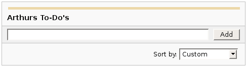
{dynamictasklist:thingsToDo}
|
The Dynamic Tasklist Macro displays a task list which can be modified in the page as it is viewed. Despite the fact that this plugin has an ajax UI, it is still fully versioned like a normal Confluence page.
Example:
| What you need to type |
What you will get |
| {dynamictasklist:Arthurs To-Do's} |
|
|
Images
Images can be embedded into Confluence pages from attached files or remote sources.
| Notation |
Comment |
!http://www.host.com/image.gif!
or
!attached-image.gif!
|
Inserts an image into the page. If a fully qualified URL is given the image will be displayed from the remote source, otherwise an attached image file is displayed.
|
!spaceKey:pageTitle^image.gif!
!/2007/05/23/My Blog Post^image.gif!
|
Inserts an image that is attached on another page or blog post. If no space key is defined, the current is space is used by default.
|
| !image.jpg|thumbnail! |
Insert a thumbnail of the image into the page (only works with images that are attached to the page). Users can click on the thumbnail to see the full-sized image. Thumbnails must be enabled by the site administrator for this to work.
|
| !image.gif|align=right, vspace=4! |
For any image, you can also specify attributes of the image tag as a comma separated list of name=value pairs like so.
|
{gallery}
{gallery:columns=3}
{gallery:title=Some office photos, and a waterfall|columns=3}
{gallery:title=Some office photos, without the waterfall|exclude=waterfall.jpg}
{gallery:title=One office photo, and a waterfall|include=office1.jpg,waterfall.jpg}
{gallery:title=Some office photos, and a waterfall|page=Gallery of Pictures}
{gallery:title=Some office photos, and a waterfall|page=DOC:Gallery of Pictures}
{gallery:title=Some office photos, and a waterfall|sort=name}
{gallery:title=Some office photos, and a waterfall|sort=date|reverse=true}
|
Create a gallery of thumbnails of all images attached to a page. This will only work on pagesthat allow attachments, obviously. The title parameter allows you to supply a title for the gallery The columns parameter allows you to specify the number of columns in the gallery (by default, 4) The exclude parameter allows you to specify the name of attached images to ignore (i.e., they will not be included in the gallery). You can specify more than one picture, separated by commas. Example: exclude=my picture.png,my picture2.gif The include parameter allows you to specifically include one or more attached images. The gallery will show only those pictures. You can specify more than one picture, separated by commas. Example: include=my picture.png,my picture2.gif The page parameter allows you specify the title of one or more pages which contains the images you want displayed. If a page is in the same space as the page containing the macro, use the format page=My Page Name. To specify a page in a different space, use page=SPACEKEY:My Page Name, such as page=DOC:Gallery Macro. You can specify more than one page, separated by commas. Example: page=Image Gallery,STAFF:Group Photos If a page or attachment file name contains a comma, you can use it in the include, exclude, or page parameters by enclosing it in single or doublequotes. Example: include="this,that.jpg",theother.png The sort parameter allows you to control the order of the images. The options are name,comment, date, or size. The reverse parameter is used in conjunction with the sort parameter to reverse the order of the specified sort. Valid values are true and false. Previous versions of the Gallery macro had an additional slideshow parameter. This is no longer used in the latest version, and the slide show is always enabled. We have left the parameter here for compatibility with older versions of the macro.
|
Tables
Tables allow you to organise content in a rows and columns, with a header row if required.
Advanced Formatting
More advanced text formatting.
| Notation |
Comment |
{code:title=Bar.java|borderStyle=solid}
// Some comments here
public String getFoo()
{
  return foo;
}
{code}
{code:xml}
<test>
    <another tag="attribute"/>
</test>
{code}
|
Makes a preformatted block of code with syntax highlighting. All the optional parameters of {panel} macro are valid for {code} too. The default language is Java but you can specify JavaScript, ActionScript, XML, HTML and SQL too.
Example:
public String getFoo()
{
return foo;
}
<test>
<another tag="attribute"/>
</test>
|
{widget:url=http://au.youtube.com/watch?v=cOE8ukQoz6E}
{widget:url=http://au.youtube.com/watch?v=cOE8ukQoz6E | width=500 | height=400}
|
Widget Connector
|
| {link}
|
Decorates standard link with styles attributes. Adds target window behavior, like open in new window or popup.
Use standard syntax Confluence page or attachment link syntax and wrap it inside {link} macro instead of standard square brackets. Then add attributes as necessary.
Parameters:
- target=[new|popup] - (Optional) by default opens in the same window
- style=[any string] - (Optional) CSS Styles
- class=[any string] - (Optional) CSS Class
- specs=[specs] - (Optional) window.open() specifications.
Examples:
{link:target=popup|style=color:blue;|specs=left=10,top=10,width=300,height=300,scrollbars=no}Open popup link|Test Page 1{link}
{link:style=color:red;}Open link in new window|Test Page 1{link}
{link:style=color:green;}Green download link|^attachement1.gif{link}
|
|
{builder-sidebar:right|collapse=true}
|
Used to force the collapse/display of the sidebars on a page-by-page basis
Parameters:
- default - the sidebar to be affected (left/right)
- collapse - should the sidebar be collapsed? (true/false)
- force - override any cookie stored value for the state (true/false - default false)
See Also: User Guide and Examples
|
|
{create-child:page title|render=true}
|
creates a child page to the current page (if it doesnt already exist)
Parameters:
- default - The child page title (if it already exists but is not a child of the current page then a number will be appended)
- template - the name of the template to apply to the child page
- portal - the name of the portal to inject into the child page
- content - the content to place into the child page
- render - pre-render the child page (default false)
See Also: User Guide and Examples
|
|
{menubar}
{menu}
{menuitem}[link]{menuitem}
{menu}
{menubar}
|
Used to display a menubar
Parameters:
- _default_ - The HTML ID (must be unique for the entire web page) associated with an item in the menu
- id - alternative (original) way of specifying the html id
- class - The CSS class name to assign to div wrapping the menu
- classname - The CSS class name to assign to items in the menu
- electric - true (or number) - Pop-up menus will automatically open when the mouse hovers over their parent item, or their parent item gets keyboard focus, false - Pop-up menus will only be displayed when the parent item is clicked or when the the parent item is selected and the left arrow key (or spacebar) is pressed (default true)
- timeout - Defines the number of milliseconds to wait before menus are automatically shown when the "electric" parameter is set to true
- vertical - false - Items on the top level of the menu bar are shown horizontally, true - Items on the top level of the menu bar are shown vertically (ideal for putting menus in sidebars) (default false)
- context - see userguide
- tooltips - true - Tooltips, if specified in linked menu items, are shown when the mouse hovers over a menu item, false - Tooltips are not shown, useful when your target audience is using a slow internet connection or slow computer (default true)
- shadows - see userguide
- smooth - true - Shadows will look smoother in most browsers (requires an additional image to be loaded), false - Basic shadows will be used (slightly faster loading of pages) (default true)
- blink - false - Menu items do not blink when clicked, true - Menu items blink a few times when clicked to give more visual feedback to the end-user (default false)
- lazy - false - After the web page loads, the entire menu is "built" immediately, true - After the web page loads, only the top level of the menu is "built" and subsequent levels (i.e. pop-up menus) are only built when they are first displayed (default false)
- toolbar - false - The top level of the menu displays normally, true - Additional styling is applied which makes items on the top level of the menu take up less space, ideal for toolbars. Note that some menu styles (e.g. the Longhorn style) don't currently support this feature (default false)
- clone - see userguide
- focus - automatically focus the menu (default false)
- scrolling - true - If a menu is too big to fit in the browser window, scroll buttons will appear at either end to allow the user to "scroll" the menu. It's a really nice feature!, false - Menus will be shown in their entirety, even if that means that part of them can't be seen within the browser window (default true)
See Also: User Guide and Examples
|
|
{watch-menu}[link]{watch-menu}
|
Used to create a menu with an icon based on the current space & page watch state
Parameters:
- class - The CSS class name to assign to an item in a menu
- subclass - The CSS class name to assign to a pop-up menu that's associated with an item in a menu
- id - The HTML ID (must be unique for the entire web page) associated with an item in the menu
- subid - The HTML ID (must be unique for entire web page) associated to a pop-up menu that's associated with an item in a menu
- autohide - true : the item will be removed if it doesn't contain a hyperlink, false : the item will always be shown regardless of whether it contains a hyperlink or not, disabled : the item will always be shown, but if it doesn't contain a hyperlink it will be "visually" disabled (e.g. grey text and faded icon) (default true)
- custom - false : a normal menu item, which may contain a pop-up menu if there are hierarchically lower items found, true : allows you to embed just about anything in a menu item, defaults the "autohide" setting to false and prevents you from having a pop-up menu associated with the item (default false)
- flat - false : a normal menu item designed for use in a hierarchical structure, true : a "flat" (non-hierarchical) menu item (default false)
- notitle - false : removes the title from submenus
- size - the size of the icon to use
- flag - Will only be rendered if any of the flags have been set using set-flag.
- notflag - Will not be rendered if any of the flags have been set using set-flag.
See Also: User Guide and Examples
|
|
{menu}
{menuitem}[link]{menuitem}
{menu}
|
Used to create a menu
Parameters:
- class - The CSS class name to assign to an item in a menu
- subclass - The CSS class name to assign to a pop-up menu that's associated with an item in a menu
- id - The HTML ID (must be unique for the entire web page) associated with an item in the menu
- subid - The HTML ID (must be unique for entire web page) associated to a pop-up menu that's associated with an item in a menu
- autohide - true : the item will be removed if it doesn't contain a hyperlink, false : the item will always be shown regardless of whether it contains a hyperlink or not, disabled : the item will always be shown, but if it doesn't contain a hyperlink it will be "visually" disabled (e.g. grey text and faded icon) (default true)
- custom - false : a normal menu item, which may contain a pop-up menu if there are hierarchically lower items found, true : allows you to embed just about anything in a menu item, defaults the "autohide" setting to false and prevents you from having a pop-up menu associated with the item (default false)
- flat - false : a normal menu item designed for use in a hierarchical structure, true : a "flat" (non-hierarchical) menu item (default false)
- notitle - false : removes the title from submenus
- flag - Will only be rendered if any of the flags have been set using set-flag.
- notflag - Will not be rendered if any of the flags have been set using set-flag.
See Also: User Guide and Examples
|
|
{submenu}
{menuitem}[link]{menuitem}
{submenu}
|
Used to create a submenu
Parameters:
- class - The CSS class name to assign to an item in a menu
- subclass - The CSS class name to assign to a pop-up menu that's associated with an item in a menu
- id - The HTML ID (must be unique for the entire web page) associated with an item in the menu
- subid - The HTML ID (must be unique for entire web page) associated to a pop-up menu that's associated with an item in a menu
- autohide - true : the item will be removed if it doesn't contain a hyperlink, false : the item will always be shown regardless of whether it contains a hyperlink or not, disabled : the item will always be shown, but if it doesn't contain a hyperlink it will be "visually" disabled (e.g. grey text and faded icon) (default true)
- custom - false : a normal menu item, which may contain a pop-up menu if there are hierarchically lower items found, true : allows you to embed just about anything in a menu item, defaults the "autohide" setting to false and prevents you from having a pop-up menu associated with the item (default false)
- flat - false : a normal menu item designed for use in a hierarchical structure, true : a "flat" (non-hierarchical) menu item (default false)
- notitle - false : removes the title from submenus
- flag - Will only be rendered if any of the flags have been set using set-flag.
- notflag - Will not be rendered if any of the flags have been set using set-flag.
See Also: User Guide and Examples
|
|
{sub-submenu}
{menuitem}[link]{menuitem}
{sub-submenu}
|
Used to create a submenu
Parameters:
- class - The CSS class name to assign to an item in a menu
- subclass - The CSS class name to assign to a pop-up menu that's associated with an item in a menu
- id - The HTML ID (must be unique for the entire web page) associated with an item in the menu
- subid - The HTML ID (must be unique for entire web page) associated to a pop-up menu that's associated with an item in a menu
- autohide - true : the item will be removed if it doesn't contain a hyperlink, false : the item will always be shown regardless of whether it contains a hyperlink or not, disabled : the item will always be shown, but if it doesn't contain a hyperlink it will be "visually" disabled (e.g. grey text and faded icon) (default true)
- custom - false : a normal menu item, which may contain a pop-up menu if there are hierarchically lower items found, true : allows you to embed just about anything in a menu item, defaults the "autohide" setting to false and prevents you from having a pop-up menu associated with the item (default false)
- flat - false : a normal menu item designed for use in a hierarchical structure, true : a "flat" (non-hierarchical) menu item (default false)
- notitle - false : removes the title from submenus
- flag - Will only be rendered if any of the flags have been set using set-flag.
- notflag - Will not be rendered if any of the flags have been set using set-flag.
See Also: User Guide and Examples
|
|
{menuitem}[link]{menuitem}
|
Used to create a menuitem
Parameters:
- class - The CSS class name to assign to an item in a menu
- subclass - The CSS class name to assign to a pop-up menu that's associated with an item in a menu
- id - The HTML ID (must be unique for the entire web page) associated with an item in the menu
- subid - The HTML ID (must be unique for entire web page) associated to a pop-up menu that's associated with an item in a menu
- autohide - true : the item will be removed if it doesn't contain a hyperlink, false : the item will always be shown regardless of whether it contains a hyperlink or not, disabled : the item will always be shown, but if it doesn't contain a hyperlink it will be "visually" disabled (e.g. grey text and faded icon) (default true)
- custom - false : a normal menu item, which may contain a pop-up menu if there are hierarchically lower items found, true : allows you to embed just about anything in a menu item, defaults the "autohide" setting to false and prevents you from having a pop-up menu associated with the item (default false)
- flat - false : a normal menu item designed for use in a hierarchical structure, true : a "flat" (non-hierarchical) menu item (default false)
- notitle - false : removes the title from submenus
- flag - Will only be rendered if any of the flags have been set using set-flag.
- notflag - Will not be rendered if any of the flags have been set using set-flag.
See Also: User Guide and Examples
|
|
{compound-menuitem:destination|caption=link text}
|
Used to create a menuitem which contains a menulink and icon
Parameters:
- caption - the text to use in the link
- default - the piece of confluence functionality you wish to link to
- RSS - go to rss feed editor
- activity - show site/space activity
- advanced - go to advanced config page
- browse - link to browse space
- builderadmin - link to builder administration
- children - show/hide children toggle
- colourscheme - go to colour scheme selector
- comments - show/hide comments toggle
- configuretheme - configure the theme
- copy - copy the current page
- custom - define a custom link
- dashboard - go to dashboard
- edit - edit the current page
- emailpage - link to email page action
- exportMail - export email to page
- exportPDF - export page to pdf
- exportWord - export page to word doc
- favourite - add page to favourites
- favouritespace - add space to favourites
- first - the first sibling page
- firstchild - the first child page
- globaltemplates - display list of global templates
- globallabels - show global labels heatmap
- history - show account history
- home - go to space home page
- index - go to space index
- information - show page information
- labels - show labels heatmap
- last - the last sibling page
- lastchild - the last child page
- login - go to login screen
- logout - log out
- mail - show space email
- managelayouts - link to manage layouts
- map - go to space map
- newcomment - add a comment
- newnews - create a new blogpost
- newpage - create a new page
- news - view space news
- newspace - create a new space
- next - the next sibling page
- normalView - view page as normal
- notationguide - link to the macro notation guide
- pageView - view the page in normal mode
- pageattachments - show page attachments
- parent - the current page's parent
- people - show the people directory
- prev - the previous sibling page
- printableView - view page as printable
- profile - show user profile
- recent - view recently updated in space
- remove - delete the current page
- search - links to the search screen
- signup - create a new account
- siteadmin - go to site administration
- spaceadmin - go to space administration
- spaceattachments - display space attachments
- spacetemplates - display list of space templates
- trimcomments - trim the comments of the current page
- toggleSidebar - toggle the visibility of a sidebar
- toggleVisibility - toggle the visibility of an html element
- use-layout - change the layout
- userspace - show user's space
- viewSource - view the page source
- viewattachments - show page attachments without checking attachment permission
- watch - watch current page/space
- watchspace - watch current space
- webui - show a webui link, requires location & key parameters
- wikipage - link to the page specified by the page & space parameters
- tooltip - the tooltip that should be displayed by the link, use @none for blank
- accesskey - the keypress that should be associated with this link
- target - the target for the link (eg _blank)
- space - the spacekey whose context the link generation should be calculated against
- page - the title of the page whose context the link generation should be calculated against
- parent - used by the exportMail link type to define the parent where the page generated from the mail shuld be created
- class - the css class to be applied to the link
- toggle - the html ID of the element whose visibility is to be toggled
- sidebar - the name of the sidebar whose visibility is to be toggled (left/right)
- link - the custom link
- icon - the icon to use as one of SPACEKEY:pagename^filename.ext/custom url/inbuilt icon (use 'noicon' to prevent an icon being displayed)
- imginside - should the icon appear inside the link (default=false)
- title - page title to use with newpage menulink
- template - template to use with newpage menulink
- layout - the layoutId to use when the link is used
- latch - whether the layout should be latched when the link is used
- class - The CSS class name to assign to an item in a menu
- id - The HTML ID (must be unique for the entire web page) associated with an item in the menu
- autohide - true : the item will be removed if it doesn't contain a hyperlink, false : the item will always be shown regardless of whether it contains a hyperlink or not, disabled : the item will always be shown, but if it doesn't contain a hyperlink it will be "visually" disabled (e.g. grey text and faded icon) (default true)
- custom - false : a normal menu item, which may contain a pop-up menu if there are hierarchically lower items found, true : allows you to embed just about anything in a menu item, defaults the "autohide" setting to false and prevents you from having a pop-up menu associated with the item (default false)
- flat - false : a normal menu item designed for use in a hierarchical structure, true : a "flat" (non-hierarchical) menu item (default false)
- location - the webui location to use with webui links
- key - the webui key to use with webui links
- linkId - the html id to be applied to the link
- flag - Will only be rendered if any of the flags have been set using set-flag.
- notflag - Will not be rendered if any of the flags have been set using set-flag.
See Also: User Guide and Examples
|
|
{menuseparator}
|
Inserts a separator into a menu
Parameters:
- class - The CSS class name to assign
See Also: User Guide and Examples
|
|
{menuicon:iconname|size=16px|tooltip=my icon}
|
Inserts a gif/png icon from the embedded library, see the userguide for more details
Parameters:
- size - the size the icon should be displayed at
- tooltip - the alternate description that should be used for the icon
- force - force the menu icon to be displayed regardless of menu settings
See Also: User Guide and Examples
|
|
{menulink:destination}link text{menulink}
|
Generates a link to the specified piece of confluence functionality, see the userguide for more information
Parameters:
- default - the piece of confluence functionality you wish to link to
- RSS - go to rss feed editor
- activity - show site/space activity
- advanced - go to advanced config page
- browse - link to browse space
- builderadmin - link to builder administration
- children - show/hide children toggle
- colourscheme - go to colour scheme selector
- comments - show/hide comments toggle
- configuretheme - configure the theme
- copy - copy the current page
- custom - define a custom link
- dashboard - go to dashboard
- edit - edit the current page
- emailpage - link to email page action
- exportMail - export email to page
- exportPDF - export page to pdf
- exportWord - export page to word doc
- favourite - add page to favourites
- favouritespace - add space to favourites
- first - the first sibling page
- firstchild - the first child page
- globaltemplates - display list of global templates
- globallabels - show global labels heatmap
- history - show account history
- home - go to space home page
- index - go to space index
- information - show page information
- labels - show labels heatmap
- last - the last sibling page
- lastchild - the last child page
- login - go to login screen
- logout - log out
- mail - show space email
- managelayouts - link to manage layouts
- map - go to space map
- newcomment - add a comment
- newnews - create a new blogpost
- newpage - create a new page
- news - view space news
- newspace - create a new space
- next - the next sibling page
- normalView - view page as normal
- notationguide - link to the macro notation guide
- pageView - view the page in normal mode
- pageattachments - show page attachments
- parent - the current page's parent
- people - show the people directory
- prev - the previous sibling page
- printableView - view page as printable
- profile - show user profile
- recent - view recently updated in space
- remove - delete the current page
- search - links to the search screen
- signup - create a new account
- siteadmin - go to site administration
- spaceadmin - go to space administration
- spaceattachments - display space attachments
- spacetemplates - display list of space templates
- trimcomments - trim the comments of the current page
- toggleSidebar - toggle the visibility of a sidebar
- toggleVisibility - toggle the visibility of an html element
- use-layout - change the layout
- userspace - show user's space
- viewSource - view the page source
- viewattachments - show page attachments without checking attachment permission
- watch - watch current page/space
- watchspace - watch current space
- webui - show a webui link, requires location & key parameters
- wikipage - link to the page specified by the page & space parameters
- tooltip - the tooltip that should be displayed by the link, use @none for blank
- accesskey - the keypress that should be associated with this link
- target - the target for the link (eg _blank)
- space - the spacekey whose context the link generation should be calculated against
- page - the title of the page whose context the link generation should be calculated against
- parent - used by the exportMail link type to define the parent where the page generated from the mail shuld be created
- class - the css class to be applied to the link
- toggle - the html ID of the element whose visibility is to be toggled
- sidebar - the name of the sidebar whose visibility is to be toggled (left/right)
- link - the custom link
- icon - the icon to use as one of SPACEKEY:pagename^filename.ext/custom url/inbuilt icon (use 'noicon' to prevent an icon being displayed)
- size - the size of the icon to use
- imginside - should the icon appear inside the link (default=false)
- title - page title to use with newpage menulink
- template - template to use with newpage menulink
- layout - the layoutId to use when the link is used
- latch - whether the layout should be latched when the link is used
- checkexists - whether userspace menulink should check to see if the user has a personal space (default false)
- force - force the comments or children link to be displayed when there are no comments or children to the page (default false)
- forceicon - force the icon to be displayed irrespective of the layout (default false)
- location - the webui location to use with webui links
- key - the webui key to use with webui links
- linkId - the html id to be applied to the link
- flag - Will only be rendered if any of the flags have been set using set-flag.
- notflag - Will not be rendered if any of the flags have been set using set-flag.
See Also: User Guide and Examples
|
|
{viewmenu}
|
Used for simplifying menu configuration by allowing the view menu to be edited separately, and then injected into another menu using this macro.
Parameters:
- hideanon - hide the menu to anonymous users (default false)
See Also: User Guide and Examples
|
|
{editmenu}
|
Used for simplifying menu configuration by allowing the edit menu to be edited separately, and then injected into another menu using this macro.
Parameters:
- hideanon - hide the menu to anonymous users (default false)
See Also: User Guide and Examples
|
{wikimenu}
* menu
** submenu
*** submenuitem
{wikimenu}
|
Allows menus to be created using wiki markup or macros which return an unordered list
See Also: User Guide and Examples
|
{add-replacement:name}value{add-replacement}
|
Allows additions to be made to menulink replacements
Parameters:
- default - The replacement text
See Also: User Guide and Examples
|
|
{builder-logo}
|
Inserts the confluence space/site logo into a builder panel
Parameters:
- global - force macro to display global logo
- class - HTML classname to apply (use 'png' to allow PieNG to recognise PNG logos)
- space - the space whose logo should be shown
See Also: User Guide and Examples
|
|
{builder-breadcrumbs}
|
Inserts the confluence breadcrumb trail into a builder panel
See Also: User Guide and Examples
|
|
{builder-pagetitle}
|
Returns the title of the current page/action
See Also: User Guide and Examples
|
|
{builder-personal-sidebar}
|
Includes the confluence personal sidebar into a builder panel
See Also: User Guide and Examples
|
|
{builder-labels}
|
Inserts the confluence quick label editor into a builder panel
See Also: User Guide and Examples
|
|
{builder-show:context=page,blogpost|mode=view|decorator=printable} ... content ... {builder-show}
|
Used to display a chunk of wiki-markup dependant on what is being displayed
Parameters:
- context - comma separated list of contexts (the kind of page being displayed eg: page, blogpost, dashboard) where the content should be shown
- mode - comma separated list of modes that the content is being viewed as (eg: view, edit) where the content should be shown
- decorator - comma separated list of decorators (eg: printable) where the content should be shown
- action - comma separated list of actions (eg: viewpage/login/logout) where the content should be shown
- spacekey - the space against which permission checks will be made (default current space)
- pagetitle - the page against which permission checks will be made (default current page)
- space - comma separated list of spaces if the content is within one of these spaces then it will be shown, the type of space can also be checked through the @global and @personal meta keys
- page - the name of a confluence page whose existance defines whether the content should be shown (@parent can be used to show data if the page not at the root level, @child/@children can be used to show data if the page has children, @childless can be used to show data if the page has no children)
- pluginkey - the key of a plugin which must be enabled for the content to be shown
- spacelabel - comma separated list of labels applied to the space for which the content should be shown
- teamlabel - comma separated list of team-labels applied to the space for which the content should be shown
- label - comma separated list of labels for which the content should be shown (recursable)
- metadata - comma separated list of metadata name:value pairs where the content should be shown (recursable)
- title - the title that the page must have for the content to be shown (recursable)
- recurse - check the page's parents for the value (default false)
- withuser - username that user/group/permission checks should be run against (inc @anonymous, @creator, @author, @current - default = @current)
- user - comma separated list of usernames that should view the content (inc @anonymous, @creator & @author)
- group - comma separated list of groups whose members should should view the content (inc @anonymous, @creator & @author)
- permission - comma separated list of permissions who can view the content (view, comment, label, createpage, createnews, edit, remove, attach, export, createspace, spaceadmin, siteadmin)
- restriction - display content if the page has a restriction in place (none/view/edit/vieworedit/viewandedit - recursable)
- useragent - comma separated list of strings which if found in the user agent will display the content
- attachment - comma separated list of filenames, one of which must be attached to the current page for the content to be displayed (use attachment= with no value to show based on whether there are any attachments)
- olderthan - show if current page was modfied before the given time period from the current date, eg olderthan=1y6m1d1h (year/month/day/hour)
- newerthan - show if current page was modfied after the given time period from the current date, eg newerthan=1y6m1d1h (year/month/day/hour)
- ip - comma separated list of ip addresses to which the content should be shown
- layout - a comma separated list of layouts to match the currently used layout, or @DEFAULT for the space default layout
- flag - a comma separated list of flags to check, will only display if at least one of the flags is present
- notflag - a comma separated list of flags to check, will only display if none of the flags are present
See Also: User Guide and Examples
|
|
{builder-hide:context=page,blogpost|mode=view|decorator=printable} ... content ... {builder-hide}
|
Used to hide a chunk of wiki-markup dependant on what is being displayed
Parameters:
- context - comma separated list of contexts (the kind of page being displayed eg: page, blogpost, dashboard) where the content should be hidden
- mode - comma separated list of modes that the content is being viewed as (eg: view, edit) where the content should be hidden
- decorator - comma separated list of decorators (eg: printable) where the content should be hidden
- action - comma separated list of actions (eg: viewpage/login/logout) where the content should be hidden
- spacekey - the space against which checks will be made (default current space)
- pagetitle - the page against which checks will be made (default current page)
- space - comma separated list of spaces if the content is within one of these spaces then it will be hidden, the type of space can also be checked through the @global and @personal meta keys
- page - the name of a confluence page whose existance defines whether the content should be hidden (@parent can be used to hide data if the page not at the root level, @child/@children can be used to hide data if the page has children, @childless can be used to hide data if the page has no children)
- pluginkey - the key of a plugin which must be enabled for the content to be hidden
- spacelabel - comma separated list of labels applied to the space for which the content should be hidden
- teamlabel - comma separated list of team-labels applied to the space for which the content should be hidden
- label - comma separated list of labels for which the content should be hidden (recursable)
- metadata - comma separated list of metadata name:value pairs where the content should be hidden (recursable)
- title - the title that the page must have for the content to be hidden (recursable)
- recurse - check the page's parents for the value (default false)
- withuser - username that user/group/permission checks should be run against (inc @anonymous, @creator, @author, @current - default = @current)
- user - comma separated list of usernames that should not view the content (inc @anonymous, @creator & @author)
- group - comma separated list of groups whose members should not should view the content (inc @anonymous, @creator & @author)
- permission - comma separated list of permissions who cannot view the content (view, comment, createpage, createnews, edit, remove, attach, export, createspace, spaceadmin, siteadmin)
- restriction - hide content if the page has a restriction in place (none/view/edit/vieworedit/viewandedit - recursable)
- useragent - comma separated list of strings which if found in the user agent will hide the content
- attachment - comma separated list of filenames, one of which must be attached to the current page for the content to be hidden (use attachment= with no value to hide based on whether there are any attachments)
- olderthan - hide if current page was modfied before the given time period from the current date, eg olderthan=1y6m1d1h (year/month/day/hour)
- newerthan - hide if current page was modfied after the given time period from the current date, eg newerthan=1y6m1d1h (year/month/day/hour)
- ip - comma separated list of ip addresses from which the content should be hidden
- layout - a comma separated list of layouts to match the currently used layout, or @DEFAULT for the space default layout
- flag - a comma separated list of flags to check, will only hide if at least one of the flags is present
- notflag - a comma separated list of flags to check, will only hide if none of the flags are present
See Also: User Guide and Examples
|
|
{builder-favicon}
|
Inserts the confluence favourite icon into a builder panel
See Also: User Guide and Examples
|
|
{builder-watchicon}
|
Inserts the confluence watch icon into a builder panel
See Also: User Guide and Examples
|
|
{builder-comments}
|
Inserts the confluence comments display and editor into a builder panel
See Also: User Guide and Examples
|
|
{builder-children}
|
Inserts the confluence children display into a builder panel
See Also: User Guide and Examples
|
|
{builder-welcome-message}
|
Inserts the confluence welcome message into a builder panel
See Also: User Guide and Examples
|
|
{builder-spacetitle}
|
Returns the title of the current space when executed within a space, otherwise returns the site title
Parameters:
- sitetitle - when set to true the site title is always returned
- global - when set to false nothing is returned when viewing a non-space page
- prefix - characters to prefix the title with
- postfix - characters to postfix the title with
- space - the space whose title should be shown
See Also: User Guide and Examples
|
|
{builder-infopanel}
|
Inserts the confluence info-panel display into a builder panel
See Also: User Guide and Examples
|
|
{import:SPACEKEY:pagetitle}
{import:spacekey=SPACEKEY|pagetitle=page title}
|
Very similar to the include macro in that it is used to display the contents of another page, but in this case rendered within the context of the current page
Parameters:
- default - either just the page title, or the spacekey and page-title pair of the page whose content should be injected
The page title may also be defined as @parent or @home in which cases the parent page and space home page will be used
- pagetitle - the title of the page where the content should come from (overriden by default param above)
- spacekey - the space where the content should come from (overriden by default param above)
- flag - a comma separated list of flags to check, will only display if at least one of the flags is present
- notflag - a comma separated list of flags to check, will only display if none of the flags are present
See Also: User Guide and Examples
|
|
{move-to:target=targetdiv} ... content ... {move-to}
|
Used to move a chunk of HTML from one place to another on the client-side. Useful for creating areas in panels that are populated with data from pages.
Parameters:
- target - the html id of the destination
- hidesource - whether the source should be hidden while the page loads (defaults to true)
- showtarget - whether to show the target after copying or not (defaults to true)
See Also: User Guide and Examples
|
|
{use-layout:layoutId}
|
Used to set the layout used for the current page.
Parameters:
- default - the layout Id of the layout to be used
- latch - true = latch the layout for the remainder of the session / false = remove any latched layout
See Also: User Guide and Examples
|
|
{list-spaces:all}
|
Returns an unordered list of all permitted spaces
Parameters:
- default - Filter the list of spaces (all/global/personal)
- teams - A comma separated list of team labels that are used to filter the list of spaces
- reverse - List the spaces in reverse order
- count - The number of spaces that should be displayed
- start - Offset from the start for listing the spaces
See Also: User Guide and Examples
|
{pagetree2:rootpage}
{pagetree2:@home|iconStyle=builder}
|
A flexible hierarchical tree view (site map) of Confluence content
Parameters:
- rootpage - The root of the pagetree (defaults to space)
- SPACEKEY:pagename - a specific page in a specific space
-
- pagename - a specific page in the current space
- @self - the current page
- @parent - the parent of the current page
- @space - the currently viewed space showing all top-level pages and also news items
- @root - same as @space
- @home - the homepage of currently viewed space (does not include news items)
- @dashboard - the Confluence dashboard showing all spaces the user has access to
- space - the space that should be used for the root of this pagetree (optional)
- page - the name of the page that should be use for the root of this pagetree (optional)
- target - the target window that the pages should open into (eg. _blank or _self)
- showIcons - whether to show icons in the tree (default true)
- selectionMode - the default click selection mode: node (default) or row
- autoCollapse - automatically collapse other nodes when a node is expanded: false (default) or true
- indent - indent each layer of the tree: true (default) or false
- showRoot - display the root node: true (default) or false
- branchStyle - the branch style (may be deprecated in future release)
- plus-lines: +/- buttons, dotted lines
- plus-nolines: +/- buttons, no lines
- ball-lines: yellow sphere buttons, dotted lines
- ball-nolines: yellow sphere buttons, no lines
- arrow: green arrow buttons, no lines
- iconStyle - the icon style:
- computer - computer style icons
- website - website style icons
- builder - Adaptavist's Builder style icons
- bookshelf - bookshelf style icons
- class - the css class to attach to the pagetree
- openpage - open the selected page on click: true (default) or false
- allowdrag - allow pages to be moved in the space/site by dragging and dropping in the tree: false (default) or true
- treename - the name of the tree (used with pagepanel macro)
- titletip - use the page title as the tooltip
- initialDepth - restrict the expansion at startup to x levels
- sort - sort pages in natural/modified/creation date order
- reverse - reverse the chosen order
See Also: User Guide and Examples
|
|
{pagepanel:treename=test}
|
hides a block of content based on the user's level
Parameters:
- rootpage - The root of the pagetree (defaults to space)
- SPACEKEY:pagename - a prefedined page
-
- pagename - a prefedined page
- @self - the current page
- @parent - the parent of the current page
- @space - the currently viewed space
- @root - the currently viewed space
- @home - the homepage of currently viewed space
- @dashboard - the confluence dashboard
- space - the space that should be used for the root of this pagetree
- page - the name of the page that should be use for the root of this pagetree
- treename - the name of the tree that this panel should react to
See Also: User Guide and Examples
|
|
{sorted-children:parent|sort=sortmode}
|
Displays a sorted list of children
Parameters:
- parent - Page whos children are to be listed
- SPACEKEY:pagename - a specific page in a specific space
-
- pagename - a specific page in the current space
- @self - the current page
- @parent - the parent of the current page
- @space - the currently viewed space showing all top-level pages and also news items
- @root - same as @space
- @home - the homepage of currently viewed space (does not include news items)
- space - the space that should be used for the root of this pagetree (optional)
- page - the name of the page that should be use for the root of this pagetree (optional)
- sort - The mode to sort in (defaults to sorted)
- sorted - Sorted using sort Id's & natural sorting
- natural - Sorted into natural order
- confluence - Confluence default sort order
See Also: User Guide and Examples
|
|
{set-sort-id:sortid}
|
Sets the sort order for a page
Parameters:
- sortid - The id value on which sorting is based (usually a number)
See Also: User Guide and Examples
|
|
{with-page:direction=ancestors|label=test} ... content ... {with-page}
|
Used to render a chunk of wiki-markup from the perspective of another page
Parameters:
- direction - the direction that the macro should look in when searching for the page to render with (REQUIRED)
- ancestor/ancestors/up - search for the page to render with amongst the ancestors of the start page
- descendant/descendants/down - search for the page to render with amongst the descendants of the start page
- sibling/siblings - search for the page to render with amongst the siblings of the start page
- children - search for the page to render with amongst the children of the start page
- none - dont search, just use the start page
- startPage - the page to start the search from
- @self - the current page (default)
- @root - the root of the current page's tree
- @parent - the parent of the current page
- @home - the homepage of the current space
- pagetitle - a named page (either the page title, or spacekey:title)
- space - comma separated list of spaces, one of which the page must be in
- title - comma separated list of titles which the page must have
- label - comma separated list of labels which the page must have at least one
- metadata - comma separated list of metadata key:value pairs, or metadata keys which the page must posess. If a value is specified then the key must have that value, if only the key is specified then any value is valid
- default - if specified, and a page is not found, then this page will be used instead
- @self - the current page
- @root - the root of the current page's tree
- @parent - the parent of the current page
- @home - the homepage of the current space
- pagetitle - a named page (either the page title, or spacekey:title)
- sort - The order that the pages should be listed in (creation/modified/recent/title/natural/unsorted - default unsorted)
- reverse - List the pages in reverse order
- count - The number of pages that should be displayed
- start - Offset from the start for listing the pages
- searchMode - list/single (default = single - Find the first page that matches)
Replacements:
|
|
{with-ancestor:label=test} ... content ... {with-ancestor}
|
Used to render a chunk of wiki-markup from the perspective of an ancestor page
Parameters:
- startPage - the page to start the search from
- @self - the current page (default)
- @root - the root of the current page's tree
- @parent - the parent of the current page
- @home - the homepage of the current space
- pagetitle - a named page (either the page title, or spacekey:title)
- space - comma separated list of spaces, one of which the page must be in
- title - comma separated list of titles which the page must have
- label - comma separated list of labels which the page must have at least one
- metadata - comma separated list of metadata key:value pairs, or metadata keys which the page must posess. If a value is specified then the key must have that value, if only the key is specified then any value is valid
- default - if specified, and a page is not found, then this page will be used instead
- @self - the current page
- @root - the root of the current page's tree
- @parent - the parent of the current page
- @home - the homepage of the current space
- pagetitle - a named page (either the page title, or spacekey:title)
- sort - The order that the pages should be listed in (creation/modified/recent/title/natural/unsorted - default unsorted)
- reverse - List the pages in reverse order
- count - The number of pages that should be displayed
- start - Offset from the start for listing the pages
- searchMode - list/single (default = single - Find the first page that matches)
Replacements:
|
|
{with-descendant:label=test} ... content ... {with-descendant}
|
Used to render a chunk of wiki-markup from the perspective of an descendant page
Parameters:
- startPage - the page to start the search from
- @self - the current page (default)
- @root - the root of the current page's tree
- @parent - the parent of the current page
- @home - the homepage of the current space
- pagetitle - a named page (either the page title, or spacekey:title)
- space - comma separated list of spaces, one of which the page must be in
- title - comma separated list of titles which the page must have
- label - comma separated list of labels which the page must have at least one
- metadata - comma separated list of metadata key:value pairs, or metadata keys which the page must posess. If a value is specified then the key must have that value, if only the key is specified then any value is valid
- default - if specified, and a page is not found, then this page will be used instead
- @self - the current page
- @root - the root of the current page's tree
- @parent - the parent of the current page
- @home - the homepage of the current space
- pagetitle - a named page (either the page title, or spacekey:title)
- sort - The order that the pages should be listed in (creation/modified/recent/title/natural/unsorted - default unsorted)
- reverse - List the pages in reverse order
- count - The number of pages that should be displayed
- start - Offset from the start for listing the pages
- searchMode - list/single (default = single - Find the first page that matches)
Replacements:
|
|
{with-sibling:label=test} ... content ... {with-sibling}
|
Used to render a chunk of wiki-markup from the perspective of a sibling page
Parameters:
- startPage - the page to start the search from
- @self - the current page (default)
- @root - the root of the current page's tree
- @parent - the parent of the current page
- @home - the homepage of the current space
- pagetitle - a named page (either the page title, or spacekey:title)
- space - comma separated list of spaces, one of which the page must be in
- title - comma separated list of titles which the page must have
- label - comma separated list of labels which the page must have at least one
- metadata - comma separated list of metadata key:value pairs, or metadata keys which the page must posess. If a value is specified then the key must have that value, if only the key is specified then any value is valid
- default - if specified, and a page is not found, then this page will be used instead
- @self - the current page
- @root - the root of the current page's tree
- @parent - the parent of the current page
- @home - the homepage of the current space
- pagetitle - a named page (either the page title, or spacekey:title)
- sort - The order that the pages should be listed in (creation/modified/recent/title/natural/unsorted - default unsorted)
- reverse - List the pages in reverse order
- count - The number of pages that should be displayed
- start - Offset from the start for listing the pages
- searchMode - list/single (default = single - Find the first page that matches)
Replacements:
|
|
{list-pages:direction=ancestors|label=test}
|
Used to output a list of other pages
Parameters:
- direction - the direction that the macro should look in when searching for the pages to render with (REQUIRED)
- ancestor/ancestors/up - search for the page to render with amongst the ancestors of the start page
- descendant/descendants/down - search for the page to render with amongst the descendants of the start page
- sibling/siblings - search for the page to render with amongst the siblings of the start page
- children - search for the page to render with amongst the children of the start page
- none - dont search, just use the start page
- startPage - the page to start the search from
- @self - the current page (default)
- @root - the root of the current page's tree
- @parent - the parent of the current page
- @home - the homepage of the current space
- pagetitle - a named page (either the page title, or spacekey:title)
- excerpt - include the excerpt in the output (default false)
- space - comma separated list of spaces, one of which the page must be in
- title - comma separated list of titles which the page must have
- label - comma separated list of labels which the page must have at least one
- metadata - comma separated list of metadata key:value pairs, or metadata keys which the pages must posess. If a value is specified then the key must have that value, if only the key is specified then any value is valid
- default - if specified, and a page is not found, then this page will be used instead
- @self - the current page
- @root - the root of the current page's tree
- @parent - the parent of the current page
- @home - the homepage of the current space
- pagetitle - a named page (either the page title, or spacekey:title)
- sort - The order that the pages should be listed in (creation/modified/recent/title/natural/unsorted - default unsorted)
- reverse - List the pages in reverse order
- count - The number of pages that should be displayed
- start - Offset from the start for listing the pages
See Also: User Guide and Examples
|
|
{list-ancestors:direction=ancestors|label=test}
|
Used output a list of other pages
Parameters:
- startPage - the page to start the search from
- @self - the current page (default)
- @root - the root of the current page's tree
- @parent - the parent of the current page
- @home - the homepage of the current space
- pagetitle - a named page (either the page title, or spacekey:title)
- excerpt - include the excerpt in the output (default false)
- space - comma separated list of spaces, one of which the page must be in
- title - comma separated list of titles which the page must have
- label - comma separated list of labels which the page must have at least one
- metadata - comma separated list of metadata key:value pairs, or metadata keys which the pages must posess. If a value is specified then the key must have that value, if only the key is specified then any value is valid
- default - if specified, and a page is not found, then this page will be used instead
- @self - the current page
- @root - the root of the current page's tree
- @parent - the parent of the current page
- @home - the homepage of the current space
- pagetitle - a named page (either the page title, or spacekey:title)
- sort - The order that the pages should be listed in (creation/modified/recent/title/natural/unsorted - default unsorted)
- reverse - List the pages in reverse order
- count - The number of pages that should be displayed
- start - Offset from the start for listing the pages
See Also: User Guide and Examples
|
|
{list-descendants:direction=ancestors|label=test}
|
Used output a list of other pages
Parameters:
- startPage - the page to start the search from
- @self - the current page (default)
- @root - the root of the current page's tree
- @parent - the parent of the current page
- @home - the homepage of the current space
- pagetitle - a named page (either the page title, or spacekey:title)
- excerpt - include the excerpt in the output (default false)
- space - comma separated list of spaces, one of which the page must be in
- title - comma separated list of titles which the page must have
- label - comma separated list of labels which the page must have at least one
- metadata - comma separated list of metadata key:value pairs, or metadata keys which the pages must posess. If a value is specified then the key must have that value, if only the key is specified then any value is valid
- default - if specified, and a page is not found, then this page will be used instead
- @self - the current page
- @root - the root of the current page's tree
- @parent - the parent of the current page
- @home - the homepage of the current space
- pagetitle - a named page (either the page title, or spacekey:title)
- sort - The order that the pages should be listed in (creation/modified/recent/title/natural/unsorted - default unsorted)
- reverse - List the pages in reverse order
- count - The number of pages that should be displayed
- start - Offset from the start for listing the pages
See Also: User Guide and Examples
|
|
{list-siblings:direction=ancestors|label=test}
|
Used to output a list of other pages
Parameters:
- startPage - the page to start the search from
- @self - the current page (default)
- @root - the root of the current page's tree
- @parent - the parent of the current page
- @home - the homepage of the current space
- pagetitle - a named page (either the page title, or spacekey:title)
- excerpt - include the excerpt in the output (default false)
- space - comma separated list of spaces, one of which the page must be in
- title - comma separated list of titles which the page must have
- label - comma separated list of labels which the page must have at least one
- metadata - comma separated list of metadata key:value pairs, or metadata keys which the pages must posess. If a value is specified then the key must have that value, if only the key is specified then any value is valid
- default - if specified, and a page is not found, then this page will be used instead
- @self - the current page
- @root - the root of the current page's tree
- @parent - the parent of the current page
- @home - the homepage of the current space
- pagetitle - a named page (either the page title, or spacekey:title)
- sort - The order that the pages should be listed in (creation/modified/recent/title/natural/unsorted - default unsorted)
- reverse - List the pages in reverse order
- count - The number of pages that should be displayed
- start - Offset from the start for listing the pages
See Also: User Guide and Examples
|
|
{first-child:page title}
|
creates a child page to the current page (if it doesnt already exist)
Parameters:
- default - The page title whose child should be shown (default @self)
- sort - the sort order that decides which child should be shown (creation/modified/recent/title/natural)
See Also: User Guide and Examples
|
|
{add-page-restriction:edit=group,user,group|view=group,user,group}
|
Adds page level restrictions to the current page (if you have permission to set permissions)
Parameters:
- edit - comma separated list of users or groups that can edit the page
- view - comma separated list of users or groups that can view the page
See Also: User Guide and Examples
|
|
{prevent-lazy-loading}
|
Used to prevent jQuery lazy loading from being used on the current page.
See Also: User Guide and Examples
|
|
{include-blog:2009/06/22/test news}
|
Includes the content of a blog-post in a page/panel
Parameters:
- default - the blog to include in year/month/day/title format
- space - the space in which the blog can be found (default = current space)
See Also: User Guide and Examples
|
|
{blog-archive}
|
Generates a nested list of links to blog posts
Parameters:
- space - A comma separated list of spaces whose posts should be listed (SPACEKEY/@all/@current/@favourite/@global/@personal - default @current)
- teams - A comma separated list of team labels that are used to filter the list of spaces
- label - A comma separated list of labels that are used to filter the list of blogposts
- author - A comma separated list of authors that are used to filter the list of blogposts
- sort - The order that the posts should be listed in (creation/modified/recent - default creation)
- reverse - List the blogposts in reverse order (default=true - oldest first)
- count - The number of posts that should be displayed (default = all)
- start - Offset from the start for listing the posts (default = 0)
- years - Nest list for each year (default - true)
- months - Nest list for each month (default - true)
- days - Nest list for each day (default - false)
- posts - Show links to each post (default - true)
- excerpt - Include the excerpt in the post display (default - true)
- none - Text to display when no posts have been found
See Also: User Guide and Examples
|
|
{blog-list:singlespace}
|
Displays a list of blog posts and excerpts
Parameters:
- default - display mode (singlespace/multispace)
- space - A comma separated list of spaces whose posts should be listed (SPACEKEY/@all/@current/@favourite/@global/@personal - default @current)
- teams - A comma separated list of team labels that are used to filter the list of spaces
- label - A comma separated list of labels that are used to filter the list of blogposts
- author - A comma separated list of authors that are used to filter the list of blogposts
- sort - The order that the posts should be listed in (creation/modified/recent - default creation)
- reverse - List the blogposts in reverse order (default=false - most recent first)
- count - The number of posts that should be displayed (default=9)
- start - Offset from the start for listing the posts (default=0)
- dateFormat - Format that dates should be displayed in (default=defined by confluence settings)
- title - Show the Title of the blogpost (default=true)
- linktitle - Link the title to the blogpost (default=true)
- excerpt - Display the excerpt of the blogpost (true/false/full - default true)
- postedby - Display the date that the post was created (true/false/date default true)
- permalink - text to use for tiny url (set as blank to omit tinyURL)
- postedByCaption - text to use for posted by
- none - Text to display when no posts have been found
See Also: User Guide and Examples
|
|
{blog-rss}
|
Generates RSS 2.0 xml
Parameters:
- space - A comma separated list of spaces whose posts should be listed (SPACEKEY/@all/@current/@favourite/@global/@personal - default @current)
- teams - A comma separated list of team labels that are used to filter the list of spaces
- author - A comma separated list of authors that are used to filter the list of blogposts
- label - A comma separated list of labels that are used to filter the list of blogposts
- sort - The order that the posts should be listed in (creation/modified/recent - default creation)
- reverse - List the blogposts in reverse order (default=false - most recent first)
- count - The number of posts that should be displayed (default=9)
- start - Offset from the start for listing the posts (default=0)
- dateFormat - Format that dates should be displayed in (default=defined by confluence settings)
- feedTitle - The title of the rss feed
- feedDesc - The descripion of the rss feed
- none - Text to display when no posts have been found
See Also: User Guide and Examples
|
|
{blog-rss-feed}
|
Tells builder to include an rss feed definition in the header of the document
Parameters:
- space - A comma separated list of spaces whose posts should be listed (SPACEKEY/@all/@current/@favourite/@global/@personal - default @current)
- teams - A comma separated list of team labels that are used to filter the list of spaces
- label - A comma separated list of labels that are used to filter the list of blogposts
- author - A comma separated list of authors that are used to filter the list of blogposts
- sort - The order that the posts should be listed in (creation/modified/recent - default creation)
- reverse - List the blogposts in reverse order (default=false - most recent first)
- count - The number of posts that should be displayed (default=9)
- start - Offset from the start for listing the posts (default=0)
- dateFormat - Format that dates should be displayed in (default=defined by confluence settings)
- feedTitle - The title of the rss feed
- feedDesc - The descripion of the rss feed
- none - Text to display when no posts have been found
See Also: User Guide and Examples
|
{blog-calendar}
{blog-calendar:space=spacekey|date=@today}
|
Displays a the blog calendar
Parameters:
- space - The space whose posts should be shown
- date - the month which should be shown (@context/@today/@creation/@modified/MMyyy - default @context)
See Also: User Guide and Examples
|
|
{builder-search}
|
Inserts the confluence quick-search box into a builder panel
See Also: User Guide and Examples
|
|
{random-excerpt:SPACEKEY:pagetitle}
|
Very similar to the include macro in that it is used to display the contents of another page, but in this case rendered within the context of the current page
Parameters:
- default - either just the page title, or the spacekey and page-title pair of the page whose children the excerpt should be randomly selected from
- title - output the page title (default - true)
- link - add more link to the page whose excerpt is being displayed (default - true)
- more - text to use for the link to the page (default - 'More ...')
- label - comma separated list of labels which the content must have at least one for it to be shown
- class - the css classname to add to the outer div
- count - the number of excerpts to be shown (default 1)
- hide - whether to hide the extra excerpts or not (default false)
See Also: User Guide and Examples
|
|
{set-flag:flagname}
|
Sets a flag to be read by the builder-show/hide flag parameter
Parameters:
- _default_ - the flag name
- state - the state of the flag (default true)
- flag - a comma separated list of flags to check, will only display if at least one of the flags is present
- notflag - a comma separated list of flags to check, will only display if none of the flags are present
See Also: User Guide and Examples
|
|
{profile-username}
|
Returns the username of the currently viewed profile, or blank if not viewing a profile
See Also: User Guide and Examples
|
|
{profile-username}
|
Returns the username of the currently viewed profile, or blank if not viewing a profile
See Also: User Guide and Examples
|
|
{content-by-user:fred}
|
Displays a simple table of all the content (pages, comments, news items, user profiles and space descriptions) created by a user (here 'fred').
|
|
{index}
|
Displays an index of all the pages in the current space, cross linked and sorted alphabetically.
|
{include:Home}
{include:FOO:Home}
{include:spaceKey=FOO|pageTitle=Home}
|
Includes one page within another (this example includes a page called "Home"). Pages from another space can be included by prefacing the page title with a space key and a colon.
The user viewing the page must have permission to view the page being included, or it will not be displayed.
|
{note:title=Be Careful}
The body of the note here..
{note}
|
Prints a simple note to the user.
- title: - (optional) the title of the note.
- icon: - (optional) if "false", dont display the icon.
|
{warning:title=Warning}
Insert warning message here!
{warning}
|
Prints a warning note to the user.
- title: - (optional) the title of the warning.
- icon: - (optional) if "false", dont display the icon.
|
{info:title=Be Careful}
This macro is useful for including helpful information in your confluence pages
{info}
|
Prints an informational note.
- title: - (optional) the title of the information box.
- icon: - (optional) if "false", dont display the icon.
|
{tip:title=Handy Hint}
Join the Confluence Mailing-List!
{tip}
|
Prints a helpful tip for the user.
- title: - (optional) the title of the tip.
- icon: - (optional) if "false", dont display the icon.
|
{noformat}
preformatted piece of text
so *no* further _formatting_ is done here
{noformat}
|
Makes a preformatted block of text with no syntax highlighting. All the optional parameters of {panel} macro are valid for {noformat} too.
- nopanel: If the value of "nopanel" is true, then the excerpt will be drawn without its surrounding panel.
Example:
|
{panel}Some text{panel}
{panel:title=My Title}Some text with a title{panel}
{panel:title=My Title| borderStyle=dashed| borderColor=#ccc| titleBGColor=#F7D6C1| bgColor=#FFFFCE}
a block of text surrounded with a *panel*
yet _another_ line
{panel}
|
Embraces a block of text within a fully customizable panel. The optional parameters you can define are the following ones:
- title: Title of the panel
- borderStyle: The style of the border this panel uses (solid, dashed and other valid CSS border styles)
- borderColor: The color of the border this panel uses
- borderWidth: The width of the border this panel uses
- bgColor: The background color of this panel
- titleBGColor: The background color of the title section of this panel
Example:
My Title
a block of text surrounded with a panel
yet another line
|
{chart:title=Fish Sold}
|| Fish Type || 2004 || 2005 ||
|| Herring | 9,500 | 8,300 |
|| Salmon | 2,900 | 4,200 |
|| Tuna | 1,500 | 1,500 |
{chart}
{chart:type=line|title=Temperatures in Brisbane|yLabel=Celcius
|dataDisplay=true|dataOrientation=vertical}
|| Month || Min || Max ||
| January | 31.3 | 37.5 |
| February | 26.8 | 32.7 |
| March | 25.1 | 28 |
| April | 18.7 | 25.3 |
{chart}
{chart:type=timeSeries|dateFormat=MM.yyyy|timePeriod=Month|
dataOrientation=vertical|rangeAxisLowerBound=0|colors=blue,gray}
|| Month || Revenue ||
| 1.2005 | 31.8 |
| 2.2005 | 41.8 |
| 3.2005 | 51.3 |
| 4.2005 | 33.8 |
| 5.2005 | 27.6 |
| 6.2005 | 49.8 |
| 7.2005 | 51.8 |
| 8.2005 | 77.3 |
| 9.2005 | 73.8 |
| 10.2005 | 97.6 |
| 11.2005 | 101.2 |
| 12.2005 | 113.7 |
|| Month || Expenses ||
| 1.2005 | 41.1 |
| 2.2005 | 43.8 |
| 3.2005 | 45.3 |
| 4.2005 | 45.0 |
| 5.2005 | 44.6 |
| 6.2005 | 43.8 |
| 7.2005 | 51.8 |
| 8.2005 | 52.3 |
| 9.2005 | 53.8 |
| 10.2005 | 55.6 |
| 11.2005 | 61.2 |
| 12.2005 | 63.7 |
{chart}
|
Displays a chart using data from the supplied table or tables.
- Chart type parameters - These parameters change what type of chart to display and the way the chart looks.
- Display control parameters
- width - The width of the chart in pixels (default is '300')
- height - The height of the chart in pixels (default is '300')
- dataDisplay - Default is false to not display the rendered body of the macro (usually the data tables). When dataDisplay=true or dataDisplay=after, the data will be displayed after the chart. When dataDisplay=before, the data will be displayed before the chart.
- imageFormat - Default is png. Format of generated image. Valid formats are png and jpg. Other formats may be also be valid if installed on your server.
- Title and label customization parameters
- title - The title of the chart.
- subTitle - A subtitle for the chart using a smaller font.
- xLabel - The label to use for the x (domain) axis
- yLabel - The label to use for the y (range) axis
- legend - A legend will be displayed unless legend=false is specified.
- Data specification parameters - The data for the chart is taken from tables found when the macro body is rendered. These options control how this data is interpreted. By default, numeric and date values are interpreted according to the Confluence global default language (locale) formats. If conversion fails, other languages defined to Confluence will be tried. Additional conversion options can be specified using the parameters below.
- tables - Comma separated list of table ids and/or table numbers contained within the body of the macro that will be used as the data for the chart. Defaults to all first level tables. If data tables are embedded in other tables, then table selection will be required. This occurs when more complex formatting is done (for example using section and column macros).
- columns - Comma separated list of column labels and/or column titles and/or column numbers for tables used for chart data. This applies to all tables processed. Defaults to all columns. Columns are enumerated starting at 1. Column label is the text for the column in the header row. Column title is the (html) title attribute for the column in the header row.
- dataOrientation - The data tables will be interpreted as columns (horizontally) representing domain and x values unless 'dataOrientation=vertical'.
- timeSeries - If 'true', the x values in an XY plot will be treated as time series data and so will be converted according date formats.
- dateFormat - For time series data, the date format allows for additional customization of the conversion of data to date values. By default, the Confluence language defined date formats will be used. If a dateFormat is specified, it will be the first format used to interpret date values. Specify a format that matches the format of the time series data. See Date Format.
- timePeriod - Specify the time period for time series data. Default is 'Day'. This defines the granularity of how the data is interpreted. Valid values are: Day, Hour, Millisecond, Minute, Month, Quarter, Second, Week, Year.
- language - If provided, the language and country specification will be used to create additional number and date formats to be used for data conversion. This specification will be used before the default languages automatically used. Valid values are 2 character ISO 639-1 alpha-2 codes.
- country - Used in combination with the language parameter. Valid values are 2 character ISO 3166 codes.
- forgive - Default is true to try to convert numeric and date values that do not totally match any of the default or user specified formats. Specify forgive=false to enforce strict data format. Data format errors will cause the chart to not be produced.
- Color customization parameters - See Colors for how to specify colors.
- bgColor - Color (default is 'white') to use as the background of the chart.
- borderColor - Color of a border around the chart. Default is to not show a border.
- colors - Comma separated list of colors used to customize category, sections, and series colors.
- Axis customization parameters - Depending on the chart type, the range and domain axis may be customized. These values are automatically generated based on the data but can be overridden by specifying one or more more of these paramters.
- rangeAxisLowerBound - range axis lower bound
- rangeAxisUpperBound - range axis upper bound
- rangeAxisTickUnit - range axis units between axis tick marks
- rangeAxisLabelAngle - angle for the range axis label in degrees
- domainAxisLowerBound - domain axis lower bound. For a date axis, this value must be expressed in the date format specified by the dateFormat parameter
- domainAxisUpperBound - domain axis upper bound. For a date axis, this value must be expressed in the date format specified by the dateFormat parameter
- domainAxisTickUnit - domain axis units between axis tick marks. For a date axis, this value represents a count of the units specified in the timePeriod parameter. The time period unit can be overridden by specifying a trailing character: y for years, M for months, d for days, h for hours, m for minutes, s for seconds, u - milliseconds
- domainAxisLabelAngle - angle for the domain axis label in degrees
- categoryLabelPosition - allows axis label text position for categories to be customized
- up45 - 45 degrees going upward
- up90 - 90 degrees going upward
- down45 - 45 degrees going downward
- down90 - 90 degrees going downward
- dateTickMarkPosition - placement of the date tick mark
- start (default) - tick mark is at the start of the date period
- middle - tick mark is in the middle of the date period
- end - tick mark is at the end of the date period
- Pie chart customization parameters
- pieSectionLabel - Format for how pie section labels are displayed. :
- %0% is replaced by the pie section key.
- %1% is replaced by the pie section numeric value.
- %2% is replaced by the pie section percent value.
Example 1: "%0% = %1%" would display something like "Independent = 20"
Example 2: "%0% (%2%)" would display something like "Independent (20%)"
- pieSectionExplode - Comma separated list of pie keys that are to be shown exploded. Defaults to no exploded sections. Note: requires jFreeChart version 1.0.3 or higher.
- Attachment parameters - These are advanced options that can be used for chart versioning, automation enablement, and to improve performance. Use these options carefully! Normally, the chart image is regenerated each time the page is displayed. These options allow for the generated image to be saved as an attachment and have subsequent access re-use the attachment. This can be useful especially when combined with the cache macro to improve performance. Depending on the options chosen, chart images can be versioned for historical purposes.
- attachment - Chart image will be saved in a attachment.
- ^attachment - chart.macro.param.attachment.attachment
- page^attachment - The chart is saved as an attachment to the page name provided.
- space:page^attachment - The chart is saved as an attachment to the page name provided in the space indicated.
- attachmentVersion - Defines the the versioning mechanism for saved charts.
- new - (default) Creates new version of the attachment.
- replace - Replaces all previous versions of the chart. To replace an existing attachment, the user must be authorized to remove attachments for the page specified.
- keep - Only saves a new attachment if an existing export of the same name does not exist. An existing attachment will not be changed or updated.
- attachmentComment - Comment used for a saved chart attachment.
- thumbnail - Default is false. If true, the chart image attachment will be shown as a thumbnail.
Colors can be specified by name or hex value. See Web-colors. The following are the valid color names that will automatically be converted.
| Color |
Hexadecimal |
Color |
Hexadecimal |
Color |
Hexadecimal |
Color |
Hexadecimal |
| black |
#000000 |
silver |
#c0c0c0 |
maroon |
#800000 |
red |
#ff0000 |
| navy |
#000080 |
blue |
#0000ff |
purple |
#800080 |
fuchsia |
#ff00ff |
| green |
#008000 |
lime |
#00ff00 |
olive |
#808000 |
yellow |
#ffff00 |
| teal |
#008080 |
aqua |
#00ffff |
gray |
#808080 |
white |
#ffffff |
Copied from Java SimpleDateFormat specification.
Date and time formats are specified by date and time pattern strings. Within date and time pattern strings, unquoted letters from 'A' to 'Z' and from 'a' to 'z' are interpreted as pattern letters representing the components of a date or time string. Text can be quoted using single quotes (') to avoid interpretation. "'" represents a single quote. All other characters are not interpreted; theyre simply copied into the output string during formatting or matched against the input string during parsing.
The following pattern letters are defined (all other characters from 'A' to 'Z' and from 'a' to 'z' are reserved):
Pattern letters are usually repeated, as their number determines the exact presentation.
- Text:
For formatting, if the number of pattern letters is 4 or more, the full form is used; otherwise a short or abbreviated form is used if available. For parsing, both forms are accepted, independent of the number of pattern letters.
- Number:
For formatting, the number of pattern letters is the minimum number of digits, and shorter numbers are zero-padded to this amount. For parsing, the number of pattern letters is ignored unless its needed to separate two adjacent fields.
- Year:
For formatting, if the number of pattern letters is 2, the year is truncated to 2 digits; otherwise it is interpreted as a number.
For parsing, if the number of pattern letters is more than 2, the year is interpreted literally, regardless of the number of digits. So using the pattern "MM/dd/yyyy", "01/11/12" parses to Jan 11, 12 A.D. For parsing with the abbreviated year pattern ("y" or "yy"), SimpleDateFormat must interpret the abbreviated year relative to some century. It does this by adjusting dates to be within 80 years before and 20 years after the time the SimpleDateFormat instance is created. For example, using a pattern of "MM/dd/yy" and a SimpleDateFormat instance created on Jan 1, 1997, the string "01/11/12" would be interpreted as Jan 11, 2012 while the string "05/04/64" would be interpreted as May 4, 1964. During parsing, only strings consisting of exactly two digits, will be parsed into the default century. Any other numeric string, such as a one digit string, a three or more digit string, or a two digit string that isnt all digits (for example, "-1"), is interpreted literally. So "01/02/3" or "01/02/003" are parsed, using the same pattern, as Jan 2, 3 AD. Likewise, "01/02/-3" is parsed as Jan 2, 4 BC.
- Month:
If the number of pattern letters is 3 or more, the month is interpreted as text; otherwise, it is interpreted as a number.
- General time zone:
Time zones are interpreted as text if they have names. For time zones representing a GMT offset value, the following syntax is used:
     GMTOffsetTimeZone:
             GMT Sign Hours : Minutes

     Sign: one of
             + -
     Hours:
             Digit
             Digit Digit

     Minutes:
             Digit Digit
     Digit: one of
             0 1 2 3 4 5 6 7 8 9
Hours must be between 0 and 23, and Minutes must be between 00 and 59. The format is locale independent and digits must be taken from the Basic Latin block of the Unicode standard. For parsing, RFC 822 time zones are also accepted.
- RFC 822 time zone:
For formatting, the RFC 822 4-digit time zone format is used:
     RFC822TimeZone:
             Sign TwoDigitHours Minutes
     TwoDigitHours:
             Digit Digit
TwoDigitHours must be between 00 and 23. Other definitions are as for general time zones. For parsing, general time zones are also accepted.
|
Confluence Content
Ways to include, summarise or refer to other Confluence content.
| Notation |
Comment |
!quicktime.mov!
!spaceKey:pageTitle^attachment.mov!
!quicktime.mov|width=300,height=400!
!media.wmv|id=media!
|
Embeds an object in a page, taking in a comma-separated of properties.
Default supported formats:- Flash (.swf)
- Quicktime movies (.mov)
- Windows Media (.wma, .wmv)
- Real Media (.rm, .ram)
- MP3 files (.mp3)
Other types of files can be used, but may require the specification of the "classid", "codebase" and "pluginspage" properties in order to be recognised by web browsers.
Common properties are:
- width - the width of the media file
- height - the height of the media file
- id - the ID assigned to the embedded object
Due to security issues, files located on remote servers are not permitted
Styling
By default, each embedded object is wrapped in a "div" tag. If you wish to style the div and its contents, override the "embeddedObject" CSS class. Specifying an ID as a property also allows you to style different embedded objects differently. CSS class names in the format "embeddedObject-ID" are used.
|
|
{bookmarks}
|
Displays a list of bookmarks using the criteria supplied.
Searching Options
- spaces comma separated list of spaces to search for. Meta space names @all, @personal, @global can also be used. (If no labels and spaces are supplied will default to current space.)
- labels list of labels that are applied to the bookmarks. (If multiple labels are specified bookmarks only have to match one label to be included.)
- creators comma separated list of users that have created bookmarks.
Sorting Options
- sort comma separated list of attributes to sort the bookmarks by. Valid values are:
- creation Bookmark Created Date
- creator Bookmark Creator Name
- title Bookmark title
Default is by created date.
- reverseSort Reverse the order of the bookmarks. Default is false.
Display Options All options default to true.
-
showAuthor
The user that created the bookmark.
-
showDate
The relative date the bookmark was created.
-
showDescription
The bookmark description.
-
showEditLinks
If the current user has permission, show quick links to edit or remove the bookmark.
-
showLabels
The labels for the bookmark.
-
showListHeader
The bookmark list header (with the rss feed link).
-
max
The maximum number of bookmarks to display. Defaults to 15.
-
showSpace
The space the bookmark is saved in
-
showViewLink
A link to the actual bookmark page
|
{spaces:width=x}
|
Displays a list of all spaces visible to the user, with linked icons leading to various space content functionality, within a table. The width parameter specifies the table width on the page.
-
width - (optional) width of table on Confluence page, defaults to 100%.
|
{recently-updated-dashboard}
{recently-updated-dashboard: spaces=sales,marketing | labels=timesheets,summaries}
|
Include a list of Confluence content which has changed recently. By default, listed content will be listed from the current space. Returned content may be filtered through the various parameters.
- spaces - (optional) comma separated list of space keys
- labels - (optional) comma separated list of labels (content associated with at least one of these will be listed)
- width - (optional) width of the rendered table on Confluence page. Defaults to 100%.
- types - Filter content by type. You can specify one or more types, separated by commas. Accepted values:
page: basic pagescomment: comments on pages or blogsblogpost/news: blog postsattachment: attachments to pages or blogsuserinfo: personal informationspacedesc: space descriptionspersonalspacedesc: personal space descriptionsmail: emails in a space
- showProfilePic - if true, display the profile pictures of the users who updated the content.
|
{global-reports: width=x}
|
Renders a list of links to global reports within a table of width x (defaults to 99%).
-
width - (optional) width of table on Confluence page, defaults to 50%.
|
{welcome-message}
|
Include the Confluence site welcome message. The site welcome message may be configured in the Administration -> General Configuration section. |
{create-space-button: size=large | width=32 | height=32}
|
Renders a create space button linked to the create space page.
-
size - small (size of 'small' uses a smaller graphic, whereas size of 'large' uses a larger one)
-
height - image height in pixels
-
width - image width in pixels
|
|
{attachments:patterns=.*doc|old=true}
|
Prints a list of attachments
- patterns: - (optional) a comma separated list of regular expressions. Only file names matching one of these are displayed.
- old: - (optional) if "true", display old versions of attachments as well.
- upload: - (optional) if "true", allow the upload of new attachments.
|
{userlister}
{userlister:groups=confluence-administrators}
{userlister:online=true}
{userlister:groups=confluence-users|online=true}
|
Lists users registered in Confluence. Either a group or groups value must be supplied. If you want all users in the system use groups=*. Supplying a groups value will list only members of those groups. The groups value supports a comma separated list of group-names.
Specifying the online value allows you to filter the user list by the user online status. Setting online=true will show only online users, whereas setting online=false will show only offline users.
If you've configured this macro to display groups which are black listed by the administrator, you will get a warning panel at the top. The warning will be automatically displayed by default. To disable the warning, you can specify showWarning=false.
|
|
{pagetree}
{pagetree:root=PageName}
{pagetree:root=PageName|sort=natural|excerpt=true|reverse=false}
{pagetree:root=@home|startDepth=3}
{pagetree:searchBox=true}
{pagetree:expandCollapseAll=true}
|
Provides page hierachal tree within a space. If no parameters are specified the root of the tree will
be the home page, a different root page can be specified by providing the page to the root
parameter.
- root: - (optional) page where the tree would be rooted from. Meta root names @self, @parent, @home can also be used.
- sort: - (optional) sorts the tree node. It my be one of the following: bitwise, creation, modified, natural, position. Default sorting is position
- excerpt: - (optional) true/false flag that indicate if a page excerpt would be included in the tree display (default is false).
- reverse: - (optional) true/false flag that allows you to reverse the order of the display (default is false).
- searchBox: - (optional) true/false flag that allows you to add a search box in the tree that would search from the root page (default is false).
- expandCollapseAll: - (optional) true/false flag that allows you to add an expand all and a collapse all row (default is false).
- startDepth: - (optional) a number that indicates the initial depth that the tree would display (default value is 1).
|
|
{pagetreesearch}
{pagetreesearch:rootPage=PageName}
{pagetreesearch:rootPage=Space:PageName}
|
Provides a search box to search a page hierachal tree within a space.
If no parameters are specified the root of the tree will be the current
page, a different root page can be specified by providing the page to the rootPage parameter.
|
{livesearch:id=1|spaceKey=KEY}
|
Show search results keystroke by keystroke.
- spaceKey: - (optional) this option searches within a single space.
|
{children}
{children:all=true}
{children:depth=x}
{children:depth=x|style=h3}
{children:excerpt=true}
{children:page=Another Page}
{children:page=/}
{children:page=SPACEKEY:}
{children:page=SPACEKEY:Page Title}
{children:first=x}
{children:sort=<mode>|reverse=<true or false>}
|
Displays the children and descendants of the current page. Specify 'all=true' to show all descendants of this page, or depth=x (where x is any number > 0) to show that many levels of descendants. The 'style' attribute can be any of 'h1' through 'h6'. If you specify a style, the top level of child pages will be displayed as headings of that level, with their children then displayed as lists below. A great way to throw together a quick contents page! You can view the children of a different page in the same space with {children:page=Another Page Title}. If you specify a page of '/', you will list all the pages in the space with no parent (i.e. the top-level pages), excluding the current page If you specify a page of 'FOO:' (the colon is required), you will list all the pages with no parent in the space with key "FOO". Specify 'excerpt=true' to also display the first line of the pages excerpt (see the excerpt macro) if it exists.
Example:
The 'sort' attribute is an optional attribute that allows you to configure how the children are sorted. Specify 'creation' to sort by content creation date, 'title' to sort alphabetically on title and 'modified' to sort of last modification date. Use the reverse attribute to optionally reverse the sorting. The 'first' attribute allows you to restrict the number of children displayed at the top level.
|
{search:query=my_query}
{search:query=my_query|maxLimit=x}
|
Does an inline site search.
- query: your query
- maxLimit=x: (where x is any number > 0) to limit the search result to a number of results.
- spacekey: specify the key of the space you want to search in
- type: specify the content type (could be page, comment, blogpost, attachment, userinfo, spacedesc)
- lastModified: specify a time period in which the content was last modified: (e.g. 3d = modified in the last 3 days, 1m3d = modified in the last month and three days)
- contributor: specify the username of the contributor of the content to be retrieved
Example:
Found 2 result(s) for home
|
{blog-posts:max=5}
{blog-posts:max=5|content=excerpts}
{blog-posts:max=5|content=titles}
{blog-posts:time=7d|spaces=@all}
{blog-posts:max=15|time=14d|content=excerpts}
{blog-posts:labels=confluence,atlassian}
{blog-posts:labels=+atlassian,+confluence,+content}
|
Displays the most recent news items in this space.
- content - lets you choose whether to display each news item in its entirety (the default), just short excerpts from each item (see the excerpt macro), or just a list of post titles.
- time - lets you choose how far back to look for news items. For example, "time=12h" would show you those items made in the last twelve hours, and "time=7d" would show items made in the last week. (The default is no limit)
- label/labels - (optional) search for content with these labels; prefix a label with '+' to require a match or '-' to exclude any content with that label. By default, at least one of the labels will be present on any matched content. Separate labels with commas or single-spaces.
- spaces - (optional) spaces to search.
Accepted values: - space keys (case-sensitive)
@self: current space@personal: personal spaces@global: global spaces@favorite/@favourite: user's favourite spaces@all/*: all spaces (that the user has permission to view)
Prefix a space with '+' to require a match or '-' to exclude any matches from that space. By default,at least one of the named spaces must match. Separate spaces with commas or single-spaces.
- type - (optional) search for types of content.
Accepted values: page: basic pagescomment: comments on pages or blogsblogpost/news: blog postsattachment: attachments to pages or blogsuserinfo: personal informationspacedesc: space descriptionspersonalspacedesc: personal space descriptionsmail: emails in a space
Prefix a type with '+' to require matches to be of that type, or '-' to exclude matches of that type.By default, matched content will be of at least one of the listed type. Separate types with commas or single-spaces.
- max/maxResults - (optional) the maximum number of results to return. Defaults to 100.
- sort - (optional) the sorting to apply to the results.
Accepted values: title: by content titlecreation: by time of creationmodified: by time of last modification (creation is the "first" modification)
- reverse - (optional) reverses the currently applied sort. This parameter must be used in conjunction with the sort parameter.
|
{excerpt}Confluence is a knowledge-sharing application that enables teams to communicate more effectively{excerpt}
{excerpt:hidden=true}This excerpt will be recorded, but will not be displayed on the page.{excerpt}
|
Marks some part of the page as the page's 'excerpt'. This doesn't change the display of the page at all, but other macros (for example children, excerpt-include and blog-posts) can use this excerpt to summarise the page's content.
- hidden: If the value of "hidden" is true, then the contents of the excerpt macro will not appear on the page.
|
{excerpt-include:Home}
{excerpt-include:Home|nopanel=true}
{excerpt-include:blogPost=/2006/12/28/News Page}
|
Includes the excerpt from one page (see the excerpt macro) within another. The included page must be in the same space as the page on which the macro is used.
- nopanel: If the value of "nopanel" is true, then the excerpt will be drawn without its surrounding panel.
|
{popular-labels}
{popular-labels:style=heatmap|count=15}
|
Renders a list (or heatmap) of the most popular labels ordered by popularity (or name).
-
count - (optional) Specify the number of labels to be displayed. If not specified, a default of 100 is used.
-
spaceKey - (optional) Restrict the popular labels to a certain space.
-
style - (optional) Allows 'heatmap'. Specifying a heatmap style will use different font sizes depending on their rank of popularity, ordered by label names. If not specified, a default list style is used ordered by popularity (highest first).
|
{contentbylabel:labels=dogs,cats}
{contentbylabel:labels=dogs,cats|space=PETS}
{contentbylabel:labels=dogs,cats|type=page,blogpost}
{contentbylabel:labels=dogs,cats|showLabels=false|showSpace=false}
{contentbylabel:labels=dogs,cats|excerpt=true}
{contentbylabel:labels=+dogs,+cats}
{contentbylabel:labels=+lebowski,+bowling,-walter|space=@all|type=page,-blogpost}
|
Displays a list of content marked with the specified labels.
-
type - (optional) search for types of content.
Accepted values: page: basic pagescomment: comments on pages or blogsblogpost/news: blog postsattachment: attachments to pages or blogsuserinfo: personal informationspacedesc: space descriptionspersonalspacedesc: personal space descriptionsmail: emails in a space
Prefix a type with '+' to require matches to be of that type, or '-' to exclude matches of that type.By default, matched content will be of at least one of the listed type. Separate types with commas or single-spaces.
-
showLabels - (optional) display the labels for each results (enabled by default)
-
showSpace - (optional) display space name for each result (enabled by default)
-
title - (optional) add a title above the results list
-
max/maxResults - (optional) the maximum number of results to display (default is 5)
-
excerpt - (optional) display first line of excerpt for each result
-
space/spaces - (optional) spaces to search.
Accepted values: - space keys (case-sensitive)
@self: current space@personal: personal spaces@global: global spaces@favorite/@favourite: user's favourite spaces@all/*: all spaces (that the user has permission to view)
Prefix a space with '+' to require a match or '-' to exclude any matches from that space. By default,at least one of the named spaces must match. Separate spaces with commas or single-spaces.
-
label/labels - (optional) search for content with these labels; prefix a label with '+' to require a match or '-' to exclude any content with that label. By default, at least one of the labels will be present on any matched content. Separate labels with commas or single-spaces.
-
sort - (optional) the sorting to apply to the results.
Accepted values: title: by content titlecreation: by time of creationmodified: by time of last modification (creation is the "first" modification)
-
reverse - (optional) reverses the currently applied sort. This parameter must be used in conjunction with the sort parameter.
|
{related-labels}
{related-labels:labels=labelone, labeltwo}
|
Renders a list of labels related to the current page's labels.
-
labels - (optional) comma-separated list of labels whose related labels will be displayed.
|
{recently-updated}
{recently-updated: spaces=sales,marketing | labels=timesheets,summaries}
{recently-updated: labels=+confluence,-jira | spaces=@all}
{recently-updated: spaces=NOVELS,SHORTSTORIES | sort=creation | reverse=true}
|
Include a list of Confluence content which has changed recently. By default, listed content will be listed from the current space. Returned content may be filtered through the various parameters.
- space/spaces - (optional) spaces to search.
Accepted values: - space keys (case-sensitive)
@self: current space@personal: personal spaces@global: global spaces@favorite/@favourite: user's favourite spaces@all/*: all spaces (that the user has permission to view)
Prefix a space with '+' to require a match or '-' to exclude any matches from that space. By default,at least one of the named spaces must match. Separate spaces with commas or single-spaces. Defaults to the current space (@self).
- label/labels - (optional) search for content with these labels; prefix a label with '+' to require a match or '-' to exclude any content with that label. By default, at least one of the labels will be present on any matched content. Separate labels with commas or single-spaces.
- width - (optional) width of the rendered table on Confluence page. Defaults to 100%.
- type/types - (optional) search for types of content.
Accepted values: page: basic pagescomment: comments on pages or blogsblogpost/news: blog postsattachment: attachments to pages or blogsuserinfo: personal informationspacedesc: space descriptionspersonalspacedesc: personal space descriptionsmail: emails in a space
Prefix a type with '+' to require matches to be of that type, or '-' to exclude matches of that type.By default, matched content will be of at least one of the listed type. Separate types with commas or single-spaces. Defaults to all content types except mail (and, when in a shared setting, personal information).
- sort - (optional) the sorting to apply to the results.
Accepted values: title: by content titlecreation: by time of creationmodified: by time of last modification (creation is the "first" modification)
- reverse - (optional) reverses the currently applied sort. This parameter must be used in conjunction with the sort parameter.
|
{recently-used-labels}
{recently-used-labels:scope=space|count=15}
|
Renders a list (or table) of labels most recently used in a specified scope.
-
count - (optional) Specify the number of labels to be displayed. If not specified, a default of 10 is used.
-
scope - (optional) Allows 'global', 'space' and 'personal'. If not specified, the 'global' scope is used. The global scope will show labels that were recently used within this confluence instance. The space scope will show labels that were recently used in the current space. The personal scope will show you personal labels that you recently used.
-
style - (optional) Allows 'table'. Specifying a table style will render the most recently used labels in a table form.
-
title - (optional) Allows you to specify a heading for the table view of this macro. See the 'style' option above.
|
{navmap:mylabel}
{navmap:mylabel|wrapAfter=3|cellWidth=110|cellHeight=20|theme=mytheme}
|
Renders the list of pages associated with the specified label as a navigable map.
A label must be specified for this macro. The following parameters are all optional:
- title - the title for this navigation map.
- wrapAfter - the number of cells to span horizontally before wrapping to the next line. (default: 5)
- cellWidth - width of individual cells in the map in pixels. (default: 90px)
- cellHeight - height of individual cells in the map in pixels. (default: 60px)
- theme - if you want to create your own look and feel for the navmap (say one with rounded corners), you can do so by adding a file to the WEB-INF/classes/templates/macros directory. The file name convention to use is: navmap-mytheme.vm. You can use whatever name you like in place of mytheme. Just make sure you specify this when calling the macro using theme=mytheme.
|
{listlabels:spaceKey=@all}
|
Renders the list of all labels or labels for a specific space sorted alphabetical.
-
spaceKey - (optional) list the labels in the specified space (current space by default). If '@all' is specified, labels in all spaces will be listed.
|
A-Z
documentation, staff, events, books, music
|
|
|
{contributors-summary:order=edits|limit=3|showAnonymous=true}
{contributors-summary:columns=edits|order=editTime}
|
Creates a table of contributor information from the current page or a group of pages.
Table Options
- groupby - (optional) Specify if the table should be grouped by contributors or pages. Default value is contributors
- columns - (optional) Specify the columns that should appear in the table as a comma separated list. Default value is edits,comments,labels. Valid values:
- edits Edit Count Column
- edited List of pages or contributors
- comments Comment Count Column
- commented List of pages or contributors
- labels Label Count Column
- labeled List of pages or contributors
- labellist List of labels
- watches Watch Count Column
- watching List of pages or contributors
- lastupdate Last time a page was updated or a contributor changed some content.
- order - (optional) The order the contributors or pages will appear in. By default the table is ordered by the number of edits.
- edits Orders the list with the highest number of edits first in the list
- name Orders the list by name alphabetically
- editTime Orders the list by the time they last edit time
- update Order by the last update time of any content
- reverse - (optional) If true the sort order will be reversed.
- limit - (optional) Limit the number of contributors displayed to this amount
- showAnonymous - (optional) Show updates by anonymous users. Default is false.
- showZeroCounts - (optional) If all the selected columns are zero, or empty should the contributor or page be displayed in the table. Default is false.
Page Searching Options
The following parameters control what pages are used to build the contributors list.
- page The page to count statistics from. If no spaces or labels are specified this will default to the current page.
- labels The label to use to search for pages. Multiple labels can be specified in a comma separated list. (A page will match if it has any of the labels.)
- spaces Specify the space for the page or labels parameter. Multiple spaces can be specified in a comma separated list. If no pages or labels are specified all pages from the space will be included. The following shortcut space names can also be used:
- @all All Spaces
- @global All Global Spaces
- @personal All Personal Spaces
- contentType Valid options are:
If not specified blog posts and pages are included.
- publishDate specify the publish date for a blog post. The date format expected is: YYYY/mm/dd
- scope For each of the pages found this parameter lets you include the children or decendants. (Each page will only be counted once if it is already in the list.)
- children include statistics from the immediate children of the page
- descendants include statistics from all descendants of the page
|
|
{contributors:order=edits}
{contributors:include=authors,labels|mode=list|showCount=true}
{contributors:order=editTime|limit=6}
|
Creates a list of contributors who have contributed to a page or a list of pages.
Display Options
- include - (optional) What type of content from the pages to base the contributor list (and the counts) on. Multiple values can be specified with a comma separated list
- authors Include page authors (default).
- comments Include page comments
- labels Include page labels
- watches Include page watches
- order - (optional) The order the contributors will appear in.
- count Order by the total count (default)
- name Order by the names of the contributors
- update Order by the last update time
Both the count and update orderings will use values from only the content specified with the include parameter.
- reverse - (optional) If true the sort order will be reversed.
- limit - (optional) Limit the number of contributors initially displayed to this amount
- mode - (optional) Sets the display mode of the macro
- inline The contributors will be displayed across the screen (default)
- list The contributors will be displayed in a list down the screen
- showAnonymous - (optional) Show edits by anonymous users. Default is false.
- showCount - (optional) Show the count for each user. Default is false.
- showLastTime - (optional) Show the last time a contribution was made by each user for any content specified by the include parameter. Default is false.
Page Searching Options
The following parameters control what pages are used to build the contributors list.
- page The page to count statistics from. If no spaces or labels are specified this will default to the current page.
- labels The label to use to search for pages. Multiple labels can be specified in a comma separated list. (A page will match if it has any of the labels.)
- spaces Specify the space for the page or labels parameter. Multiple spaces can be specified in a comma separated list. If no pages or labels are specified all pages from the space will be included. The followingshortcut space names can also be used:
- @all All Spaces
- @global All Global Spaces
- @personal All Personal Spaces
- contentType Valid options are:
If not specified blog posts and pages are included.
- publishDate specify the publish date for a blog post. The date format expected is: YYYY/mm/dd
- scope For each of the pages found this parameter lets you include the children or decendants. (Each page will only be counted once if it is already in the list.)
- children include statistics from the immediate children of the page
- descendants include statistics from all descendants of the page
Advanced Options
- showPages - show a list of pages returned above the list. Useful for debugging.
- noneFoundMessage - override the default message that is displayed when no contributors are found.
|
{toc:style=disc|indent=20px}
{toc:outline=true|indent=0px|minLevel=2}
{toc:type=flat|separator=pipe|maxLevel=3}
|
Creates a Table of Contents for headings on the the current page.
- type - (optional) The type of output. May be one of the following:
- list - (default) The headings are output in hierarchical list format.
- flat - The headings are listed on a single line with a separator between them.
- class - (optional) If specified, the TOC will be output with the specified CSS class. Also, if set, no other style values will be output.
- style - (optional) The style of the list items if in list mode. The style may be any of the following:
- none - (default) Headings are output in indented lists with no bullet points or numbers prefixing them.
- any CSS style - Headings are output in indented lists with the specified CSS style.
- outline - (optional) If set to true, each item will be prefixed with a number in the format 'X.Y'. The numbers will increase automatically, and extra levels will be added for lower-level headings.
- ident - (optional) The amount to indent each list sub-heading by (default is '10px').
- separator - (optional) The type of separator to use if the style is flat. May be one of the following:
- bracket - Square brackets ('[', ']') surrounding each item. (default)
- brace - Square brackets ('[', ']') surrounding each item. (default)
- comma - A comma (',') between each item.
- paren - Parentheses ('(', ')') surrounding each item.
- pipe - A pipe ('|') between each item.
- newline - A line break after each item.
- "custom" - Any other character you wish, specified between quotes.
- minLevel - (optional) The lowest heading level to include (inclusive). (default is 1).
- maxLevel - (optional) The highest heading level to include (inclusive). (default is 7).
- includePages - (optional) If 'true', any included Confluence pages will be imported and listed.
- include - (optional) If set, any headings not matching the regular expression will be ignored. Due to '|' being the parameter separator in macros, use ',' where you would have usually used '|'.
- exclude - (optional) If set, any headings matching the regular expression will be excluded. Due to '|' being the parameter separator in macros, use ',' where you would have usually used '|'.
- printable - (optional) If set to 'false', the table of contents will not be visible when being printed.
|
{toc-zone:separator\=brackets|location=top}
h1. First Heading
blah blah blah...
{toc-zone} |
Creates a Table of Contents for headings contained in the macro body.
- location - (optional) The location to have the table of contents output. May be 'top' or 'bottom'. If not set, it will be output at both locations.
- type - (optional) The type of output. May be one of the following:
- list - (default) The headings are output in hierarchical list format.
- flat - The headings are listed on a single line with a separator between them.
- class - (optional) If specified, the TOC will be output with the specified CSS class. Also, if set, no other style values will be output.
- style - (optional) The style of the list items if in list mode. The style may be any of the following:
- none - (default) Headings are output in indented lists with no bullet points or numbers prefixing them.
- any CSS style - Headings are output in indented lists with the specified CSS style.
- outline - (optional) If set to true, each item will be prefixed with a number in the format 'X.Y'. The numbers will increase automatically, and extra levels will be added for lower-level headings.
- ident - (optional) The amount to indent each list sub-heading by (default is '10px').
- separator - (optional) The type of separator to use if the style is flat. May be one of the following:
- bracket - Square brackets ('[', ']') surrounding each item. (default)
- brace - Square brackets ('[', ']') surrounding each item. (default)
- comma - A comma (',') between each item.
- paren - Parentheses ('(', ')') surrounding each item.
- pipe - A pipe ('|') between each item.
- newline - A line break after each item.
- "custom" - Any other character you wish, specified between quotes.
- minLevel - (optional) The lowest heading level to include (inclusive). (default is 1).
- maxLevel - (optional) The highest heading level to include (inclusive). (default is 7).
- includePages - (optional) If 'true', any included Confluence pages will be imported and listed.
- include - (optional) If set, any headings not matching the regular expression will be ignored. Due to '|' being the parameter separator in macros, use ',' where you would have usually used '|'.
- exclude - (optional) If set, any headings matching the regular expression will be excluded. Due to '|' being the parameter separator in macros, use ',' where you would have usually used '|'.
- printable - (optional) If set to 'false', the table of contents will not be visible when being printed.
|
{viewfile:presentation.ppt}
{viewfile:space=dog|page=testpage|name=worddocument.doc}
{viewfile:spreadsheet.xls|grid=false|sheet=Sheet 1|row=4|col=5}
{viewfile:slideshow.pdf|width=200|height=150}
|
Embeds the content of a file attachment into a Confluence page.
Supported formats:
- Microsoft Word Documents
- Embedded as html
- Microsoft Excel Spreadsheets
- Embedded as html
- Microsoft Powerpoint Presentations
- Embedded in a flash slideshow control or as a single image for individual pages
- Adobe PDF files
- Embedded in a flash slideshow control or as a single image for individual pages
- space: - (optional)the space key for the attachment. The default is the space of the page calling the macro.
- page: - (optional)the page or blog post that contains the attachment. The default is the page calling the macro.
- date: - (optional)the date of the blog post that contains the attachment in the form mm/dd/yyyy. Only applicable if the file is attached to a blog post
- name: - (required)the filename of the attachment. Can also be specified as the first argument using macro shorthand. {viewfile:filename.ext}
Macro arguments specific to Excel spreadsheets
- grid - (optional)If true, the worksheet gridlines will be rendered. The default is true.
- sheet - (optional)The name of the worksheet to render. The default is the first sheet in the workbook
- row - (optional)the last row in the worksheet to render. The default is the last row with content.
- col - (optional)the last column in the worksheet to render. The default the last column with content.
Macro arguments specific to Powerpoint and PDF presentations
- slide - (optional)instead of an entire slideshow, you can specify a slide index (0-based). the slide at the specified index will be rendered as a jpg image in the page.
- height - (optional)overrides the default height of the flash control or image.
- width - (optional)overrides the default width of the flash control or image.
|
|
{incoming-links}No links exist{incoming-links}
{incoming-links:style=square|excerpt=true}
{incoming-links:scope=Another Page>children}
{incoming-links:scope=A Different Page>descendents}
{incoming-links:spaces=MYSPACE}
{incoming-links:page=Another Page|types=page,comment}
|
Creates a list of pages which link to the current page.
Wiki content may be included as the body to be shown if no links exist.
Display Options
- page - The page to search on.
- mode - The mode in which incoming links are displayed. Available modes:
- list - Links are displayed in a bullet-pointed list.
- flat - Links are displayed in a single row, with a separator between each item.
- separator - The style of separator to have. Defaults to
', ' when in flat mode.
Available separators:
- brackets - Each item is surrounded by square brackets ('[' and ']').
- braces - Each item is surrounded by curly braces ('{' and '}').
- parens - Each item is surrounded by parentheses ('(' and ')').
- pipe - Each item is separated by a pipe ('|').
- other - The value is the separator.
- style - The style of the bullet points. Some styles may not be available depending on the mode.
Available styles:
- icons - displays the Confluence page-type icon (default)
- none - no bullet point displayed
- other CSS styles - disc, square, upper-roman, lower-roman, etc
- excerpt - Will output any excerpts which have been set on the linking page.
- sort - Allows the sort order to be specified. More than one sort may be specified
and they will be processed in order. Also, each sort item may be followed by 'desc' to indicate
the item should be sorted in descending order. Eg. "modification date desc, natural title". Valid options are:
- natural title - Sorted by the unicode-safe natural order of the content title. (Default)
- exact title - Sorted by the exact content title.
- creation date - Sorted by the creation date of the content.
- modification date - Sorted by the last-modified date of the content.
- space key - Sorted by the space key the content is contained in.
- space name - Sorted by the unicode-safe natural order of the space name.
- maxResults - Outputs up to this number of results. Default is unlimited.
Filtering Options
In general, all filtering parameters are lists of optional, required or excluded values.
Optional items simply list the value, required items are prefixed with a '+', and excluded values
are prefixed with a '-'. Each value is separated by a ',' or a ';'. For example, to specify that only content which has the "foo" label but
not the "bar" label would look like this:
labels=foo, -bar
If you need to specify a value which contains any of the special characters (namely +, -, ", ; and comma), just
wrap it in a set of quotes. Eg:
labels="foo-bar"
This will work for all filter properties below.
- scope - List of pages, news items, etc which are in scope. If the content is a page,
the scope can be expanded to their children, descendents or ancestors:
- >children - The direct children of the specified page. Eg. 'scope=My Page>children'
- >descendents - All descendents of the specified page. Eg. 'scope="My Page">descendents'
- >ancestors - All ancestors of the specified page. Eg. 'scope=My Page>ancestors'
- labels - List of label checks. Eg. "one, +two, -three" would list content which had the "two" label but not the "three" label.
- spaces - Will only list linking pages in the specified spaces. Spaces should be comma-separated. May also be one
of the following special values:
- @all - All spaces, both personal and global
- @personal - All personal spaces
- @global - All non-personal spaces
- @favourites - All the current user's favourite spaces
- types - Will only list linking pages of the specified types. Types should be comma-separated. Valid types include:
- page - Wiki pages
- news - Blog/News posts
- comment - Page or blog comments
- spacedescription - Space description
- userinfo - User profile
- attachment - An attachment
- mail - Mail archive
- mailto - A 'mailto' link
- url - An external URL.
- unresolved - An unresolved link.
|
|
{outgoing-links}No links exist{outgoing-links}
{outgoing-links:style=square|excerpt=true}
{outgoing-links:scope=Another Page>children}
{outgoing-links:scope=A Different Page>descendents}
{outgoing-links:spaces=MYSPACE}
{outgoing-links:types=page,comment}
|
Creates a list of pages, websites and email addresses the current page links to.
Wiki content may be included as the body to be shown if no links exist.
Display Options
- page - The page to search on.
- mode - The mode in which links are displayed. Available modes:
- list - Links are displayed in a bullet-pointed list.
- flat - Links are displayed in a single row, with a separator between each item.
- separator - The style of separator to have. Defaults to
', ' when in flat mode.
Available separators:
- brackets - Each item is surrounded by square brackets ('[' and ']').
- braces - Each item is surrounded by curly braces ('{' and '}').
- parens - Each item is surrounded by parentheses ('(' and ')').
- pipe - Each item is separated by a pipe ('|').
- other - The value is the separator.
- style - The style of the bullet points. Some styles may not be available depending on the mode.
Available styles:
- icons - displays the Confluence page-type icon (default)
- none - no bullet point displayed
- other CSS styles - disc, square, upper-roman, lower-roman, etc
- excerpt - Will output any excerpts which have been set on the linking page.
- sort - Allows the sort order to be specified. More than one sort may be specified
and they will be processed in order. Also, each sort item may be followed by 'desc' to indicate
the item should be sorted in descending order. Eg. "modification date desc, natural title". Valid options are:
- natural title - Sorted by the unicode-safe natural order of the content title. (Default)
- exact title - Sorted by the exact content title.
- creation date - Sorted by the creation date of the content.
- modification date - Sorted by the last-modified date of the content.
- space key - Sorted by the space key the content is contained in.
- space name - Sorted by the unicode-safe natural order of the space name.
- maxResults - Outputs up to this number of results. Default is unlimited.
Filtering Options
In general, all filtering parameters are lists of optional, required or excluded values.
Optional items simply list the value, required items are prefixed with a '+', and excluded values
are prefixed with a '-'. Each value is separated by a ',' or a ';'. For example, to specify that only content which has the "foo" label but
not the "bar" label would look like this:
labels=foo, -bar
If you need to specify a value which contains any of the special characters (namely +, -, ", ; and comma), just
wrap it in a set of quotes. Eg:
labels="foo-bar"
This will work for all filter properties below.
- scope - List of pages, news items, etc which are in scope. If the content is a page,
the scope can be expanded to their children, descendents or ancestors:
- >children - The direct children of the specified page. Eg. 'scope=My Page>children'
- >descendents - All descendents of the specified page. Eg. 'scope="My Page">descendents'
- >ancestors - All ancestors of the specified page. Eg. 'scope=My Page>ancestors'
- labels - List of label checks. Eg. "one, +two, -three" would list content which had the "two" label but not the "three" label.
- spaces - Will only list linking pages in the specified spaces. Spaces should be comma-separated. May also be one
of the following special values:
- @all - All spaces, both personal and global
- @personal - All personal spaces
- @global - All non-personal spaces
- @favourites - All the current user's favourite spaces
- types - Will only list linking pages of the specified types. Types should be comma-separated. Valid types include:
- page - Wiki pages
- news - Blog/News posts
- comment - Page or blog comments
- spacedescription - Space description
- userinfo - User profile
- attachment - An attachment
- mail - Mail archive
- mailto - A 'mailto' link
- url - An external URL.
- unresolved - An unresolved link.
|
|
{orphaned-links}No links exist{orphaned-links}
{orphaned-links:style=square|excerpt=true}
{orphaned-links:scope=Another Page>children}
{orphaned-links:scope=A Different Page>descendents}
{orphaned-links:spaces=MYSPACE}
{orphaned-links:types=page,comment}
|
Creates a list of pages which do not have any other pages linking to them.
Wiki content may be included as the body to be shown if no links exist.
Display Options
- page - The page to search on.
- mode - The mode in which links are displayed. Available modes:
- list - Links are displayed in a bullet-pointed list.
- flat - Links are displayed in a single row, with a separator between each item.
- separator - The style of separator to have. Defaults to
', ' when in flat mode.
Available separators:
- brackets - Each item is surrounded by square brackets ('[' and ']').
- braces - Each item is surrounded by curly braces ('{' and '}').
- parens - Each item is surrounded by parentheses ('(' and ')').
- pipe - Each item is separated by a pipe ('|').
- other - The value is the separator.
- style - The style of the bullet points. Some styles may not be available depending on the mode.
Available styles:
- icons - displays the Confluence page-type icon (default)
- none - no bullet point displayed
- other CSS styles - disc, square, upper-roman, lower-roman, etc
- excerpt - Will output any excerpts which have been set on the linking page.
- sort - Allows the sort order to be specified. More than one sort may be specified
and they will be processed in order. Also, each sort item may be followed by 'desc' to indicate
the item should be sorted in descending order. Eg. "modification date desc, natural title". Valid options are:
- natural title - Sorted by the unicode-safe natural order of the content title. (Default)
- exact title - Sorted by the exact content title.
- creation date - Sorted by the creation date of the content.
- modification date - Sorted by the last-modified date of the content.
- space key - Sorted by the space key the content is contained in.
- space name - Sorted by the unicode-safe natural order of the space name.
- maxResults - Outputs up to this number of results. Default is unlimited.
Filtering Options
In general, all filtering parameters are lists of optional, required or excluded values.
Optional items simply list the value, required items are prefixed with a '+', and excluded values
are prefixed with a '-'. Each value is separated by a ',' or a ';'. For example, to specify that only content which has the "foo" label but
not the "bar" label would look like this:
labels=foo, -bar
If you need to specify a value which contains any of the special characters (namely +, -, ", ; and comma), just
wrap it in a set of quotes. Eg:
labels="foo-bar"
This will work for all filter properties below.
- scope - List of pages, news items, etc which are in scope. If the content is a page,
the scope can be expanded to their children, descendents or ancestors:
- >children - The direct children of the specified page. Eg. 'scope=My Page>children'
- >descendents - All descendents of the specified page. Eg. 'scope="My Page">descendents'
- >ancestors - All ancestors of the specified page. Eg. 'scope=My Page>ancestors'
- labels - List of label checks. Eg. "one, +two, -three" would list content which had the "two" label but not the "three" label.
- spaces - Will only list linking pages in the specified spaces. Spaces should be comma-separated. May also be one
of the following special values:
- @all - All spaces, both personal and global
- @personal - All personal spaces
- @global - All non-personal spaces
- @favourites - All the current user's favourite spaces
- types - Will only list linking pages of the specified types. Types should be comma-separated. Valid types include:
- page - Wiki pages
- news - Blog/News posts
- comment - Page or blog comments
- spacedescription - Space description
- userinfo - User profile
- attachment - An attachment
- mail - Mail archive
- mailto - A 'mailto' link
- url - An external URL.
- unresolved - An unresolved link.
|
|
{undefined-links}No links exist{undefined-links}
{undefined-links:style=square|excerpt=true}
{undefined-links:scope=Another Page>children}
{undefined-links:scope=A Different Page>descenents}
{undefined-links:spaces=MYSPACE}
{undefined-links:types=page,comment}
|
Creates a list of pages which are linked to but have not yet been created.
Wiki content may be included as the body to be shown if no links exist.
Display Options
- page - The page to search on.
- mode - The mode in which links are displayed. Available modes:
- list - Links are displayed in a bullet-pointed list.
- flat - Links are displayed in a single row, with a separator between each item.
- separator - The style of separator to have. Defaults to
', ' when in flat mode.
Available separators:
- brackets - Each item is surrounded by square brackets ('[' and ']').
- braces - Each item is surrounded by curly braces ('{' and '}').
- parens - Each item is surrounded by parentheses ('(' and ')').
- pipe - Each item is separated by a pipe ('|').
- other - The value is the separator.
- style - The style of the bullet points. Some styles may not be available depending on the mode.
Available styles:
- icons - displays the Confluence page-type icon (default)
- none - no bullet point displayed
- other CSS styles - disc, square, upper-roman, lower-roman, etc
- excerpt - Will output any excerpts which have been set on the linking page.
- sort - Allows the sort order to be specified. More than one sort may be specified
and they will be processed in order. Also, each sort item may be followed by 'desc' to indicate
the item should be sorted in descending order. Eg. "modification date desc, natural title". Valid options are:
- natural title - Sorted by the unicode-safe natural order of the content title. (Default)
- exact title - Sorted by the exact content title.
- creation date - Sorted by the creation date of the content.
- modification date - Sorted by the last-modified date of the content.
- space key - Sorted by the space key the content is contained in.
- space name - Sorted by the unicode-safe natural order of the space name.
- maxResults - Outputs up to this number of results. Default is unlimited.
Filtering Options
In general, all filtering parameters are lists of optional, required or excluded values.
Optional items simply list the value, required items are prefixed with a '+', and excluded values
are prefixed with a '-'. Each value is separated by a ',' or a ';'. For example, to specify that only content which has the "foo" label but
not the "bar" label would look like this:
labels=foo, -bar
If you need to specify a value which contains any of the special characters (namely +, -, ", ; and comma), just
wrap it in a set of quotes. Eg:
labels="foo-bar"
This will work for all filter properties below.
- scope - List of pages, news items, etc which are in scope. If the content is a page,
the scope can be expanded to their children, descendents or ancestors:
- >children - The direct children of the specified page. Eg. 'scope=My Page>children'
- >descendents - All descendents of the specified page. Eg. 'scope="My Page">descendents'
- >ancestors - All ancestors of the specified page. Eg. 'scope=My Page>ancestors'
- labels - List of label checks. Eg. "one, +two, -three" would list content which had the "two" label but not the "three" label.
- spaces - Will only list linking pages in the specified spaces. Spaces should be comma-separated. May also be one
of the following special values:
- @all - All spaces, both personal and global
- @personal - All personal spaces
- @global - All non-personal spaces
- @favourites - All the current user's favourite spaces
- types - Will only list linking pages of the specified types. Types should be comma-separated. Valid types include:
- page - Wiki pages
- news - Blog/News posts
- comment - Page or blog comments
- spacedescription - Space description
- userinfo - User profile
- attachment - An attachment
- mail - Mail archive
- mailto - A 'mailto' link
- url - An external URL.
- unresolved - An unresolved link.
|
External Content
Ways to include, summarise or refer to content from other servers.
| Notation |
Comment |
{rss:url=http://host.com/rss.xml}
{rss:url=http://host.com/rss.xml|max=5}
{rss:url=http://host.com/rss.xml|showTitlesOnly=true}
|
Display the contents of a remote RSS feed within the page. Note: feeds are cached for 60 minutes before being retrieved again.
The 'max' parameter can be used to limit the number of entries displayed.
Example:
 Sample RSS Feed
(RSS 2.0)
Sample RSS Feed
(RSS 2.0)
(Feed description here...)
|
My Item
(
Dec 30, 2003 06:53)
And part of the item content here...
|
Another Item
(
Dec 30, 2003 06:53)
And part of the item content here...
|
You can specify 'showTitlesOnly=true' to show only the RSS feed titles. This parameter defaults to false.
You can specify 'titleBar=false' to hide the feeds titlebar. This parameter defaults to true.
You can specify anonymous=false to download the target content over a trusted connection (Trusted Application). For instance {rss:url=http://example.com/path/to/target/location}. This parameter defaults to true.
|
{im:myscreenname|service=AIM}
{im:me@hotmail.com|service=MSN|showid=false}
|
Displays a graphic indication of whether an IM user is online. You must supply a valid user ID as the default argument and the desired service.
Parameters
- (default) - The user id/screen name.
- service - The name of the service to check. May be 'aim', 'gtalk', 'icq', 'msn', 'sametime', 'skype', 'wildfire' or 'yahoo'.
- showid - (optional) If 'false', the user's id will not be shown.
|
{jiraissues:url=http://jira.xml.url}
{jiraissues:url=http://jira.xml.url|
columns=type;key;summary}
{jiraissues:url=http://jira.xml.url|
count=true}
{jiraissues:url=http://jira.xml.url|
cache=off}
{jiraissues:url=http://jira.xml.url?
os_username=johnsmith&os_password=secret}
{jiraissues:url=http://jira.xml.url|
anonymous=true}
|
Imports and displays JIRA issue list as inline content for the page. You can easily customize the list and order of the columns being displayed, by specifying columns parameter.
The url should be copied from the XML link of Jira's Issue Navigator. Refer to the JIRA Issues Macro documentation for further details.
To specify a custom title (the text above the columns), you can specify the title parameter. By default this is JIRA Issues. A custom title can be specified by adding title=<My Custom Title> to the macros parameters.
You can control how wide the {jiraissues} macro renders by specifying a width parameter. To specify the width in percentage, use width=XX%. To specify the width in pixels, use width=XXpx. If unspecified, the width will be 100%.
Not specifying columns will lead into the default column list and order.
Allowed columns are: key, summary, type, created, updated, assignee, reporter, priority, status, resolution.
Specifying count=true will cause the macro to just print out how many issues were in the list, without printing the list.
Using cache=off will force the macro to refresh its internal cache of Jira issues.
Note: Certain filters may require a logged-in user in order to work. If a trust association has been established between Confluence and JIRA, user authentication details will be passed between the servers automatically. This functionality requires JIRA 3.12 or later. If a trust association is not available you can send the required login by appending:
&os_username=yourJiraUsername&os_password=yourJiraPassword
to the end of your jira issues URL.
You can prevent the jiraissues macro from attempting to use a trusted application link by specifying anonymous=true. Issues will then be retrieved anonymously.
Example:
|
|
{jiraportlet:url=http://jira.portlet.url}
|
Imports and displays JIRA 3 portlet into a Confluence page.
You can get the URL for the portlet by configuring the portlet into your JIRA dashboard. While in configuration mode, you can copy the portlet URL from the top of the portlet display.
Note: Certain filters may require a logged-in user in order to work. Hence you may need to append:
&os_username=yourJiraUsername&os_password=yourJiraPassword
to the end of your portlet url.
|
{junitreport:directory=file:///c:/test-reports}
(currently only picks up result files in XML format. Set ant formatter to "xml")
{junitreport:url=file:///test-reports/TestRep.xml}
|
Displays the results of a series (or single) JUnit test.
| Success Rate |
Tests |
Failures |
Time(s) |
Time(s) |
| 93% |
|
14 |
1 |
0 |
1.531 |
|
|
{plugins-supported}
{plugins-supported:profileKey=confluence}
{plugins-supported:profileKey=confluence|by=atlassian}
|
Lists supported plugins.
- profileKey — The profile from which to get a list of plugins to display.
- by — Lets you filter the list of plugins by the name of the person or organization that supports them.
|
|
{plugin-compatibility-matrix}
{plugin-compatibility-matrix:key=confluence.repository.client}>
{plugin-compatibility-matrix:key=confluence.repository.client|productStart=2.7|productEnd=2.9}
|
Shows a plugins compatibility with versions of a product.
- key — The key of the plugin to show compatibility information of.
- productStart — The starting product version to show compatibility with. For instance, you can specify a value like 2.8 and the compatibility matrix will show compatibility information of the concerned plugin with product version 2.8 and above.
- productEnd — This is the same as productStart. The only difference is that this is used as the upper boundary of the product version range, instead of lower.
- majorVersionsOnly — If set to true, the generated compatibility matrix will only show compatibility with major versions of the product. If this is true, the plugin will assume the concerned plugin to be compatible with a major version of a product only:
- When a version of the plugin is explicitly marked compatibile with any minor version of the product, and...
- The same version of the plugin is not marked incompatible with any minor version of the product.
By default, this is true.
- rows — The number of the latest X versions of the plugin to show compatibility of. By default, all versions of the plugin is shown.
- showBrokenBuilds — Lets you to choose whether to display broken builds as
 . By default, this is false and broken build cells are blank. . By default, this is false and broken build cells are blank.
|
Misc
Macros
Macros allow you to perform programmatic functions within a page, and can be used for generating more complex content structures.
| Notation |
Comment |
|
{html}
|
The HTML macro allows you to use HTML code within a Confluence page. Note that the HTML macro will only be available if it has been enabled by your Confluence administrator. Example: {html}<a href="www.host.com">click here</a>{html}
|
{vote:What is your favorite color?}
Red
Blue
None of the above
{vote}
{vote:What is your favorite color?|changeableVotes=true|voters=user1,user2}
Red
Blue
None of the above
{vote}
|
The vote macro allows Confluence users to vote on any topic of interest.
Users are allowed to select only one of the given choices and vote one time,
and the results will not be visible to them until they have voted. Users
that have not logged in will be prompted to do so before allowing them to
cast a vote. This macro was created to support quick, informal votes on
various topics. The macro has a title and a series of choices, each choice
starting on its own line.
| Parameter |
Required |
Default |
Description |
|
true |
|
This is the title of the ballot and must be the first paramter. |
| voters |
false |
all users |
This is a comma seperated list of usernames to who are allowed to
cast a vote. Users not in this list will not be allowed to vote, but
if they are viewers will be shown the results of the vote. If this parameter
is not specified, all users with access to the page are considered voters.
|
| viewers |
false |
all users |
This is a comma seperated list of usernames to who are allowed to see the survey results.
Users not in this list will be allowed to vote but
after doing so will simply be shown which item they voted for. If a user is in this
list but is not a voter, they will be taken straight to the results. If this parameter is not specified,
all users will be able to see the results.
|
| changeableVotes |
false |
false |
This parameter, if set to true, will allow the voters to change their vote
after it has been cast.
|
| locked |
false |
false |
Dont allow any further voting. Show a lock Symbol to indicate that. |
Before the user logs in:
| What is your favorite color? (Log In to vote.) |
| Choices |
Your Vote |
| Red |

|
| Blue |
|
| None of the above |
|
Before the logged-in user votes:
| What is your favorite color? |
| Choices |
Your Vote |
| Red |

|
| Blue |
|
| None of the above |
|
After the logged-in user votes:
| What is your favorite color? |
| Choices |
Your Vote |
Current Results: (10 total votes) |
| Red |

|
|
| Blue |
|
|
| None of the above |
|
|
|
{survey:changeableVotes=true|voters=user1,user2|viewers=user3}
Knowledge - This is the knowledge category.
Communication - This is the communication category.
{survey}
|
The survey macro allows Confluence users to be surveyed on several categories.
For each category, users are allowed to select only one of the given choices,
and the results will not be visible to them until they have voted. Users
that have not logged in will be prompted to do so before allowing them to
cast a vote. This macro was created to support surveys of confluence users
on several categories and will provide them with the chance to give a
rating (1 to 5) for each category as well as a comment.
The body of this macro defines the categories that the users will be polled
on. Each line of the body will be treated as a seperate category and
should be written in the format "title - description". The title is
always required but the dash and the description are optional.
| Parameter |
Required |
Default |
Description |
| title |
false |
default no title |
If a Title is specified the Survey gets a Box around which makes it looking more compact
and feeling the votes are belonging more together.
|
| voters |
false |
all users |
This is a comma seperated list of usernames to who are allowed to
cast a vote. Users not in this list will not be allowed to vote, but
if they are viewers will be shown the results of the vote. If this parameter
is not specified, all users with access to the page are considered voters.
|
| viewers |
false |
all users |
This is a comma seperated list of usernames to who are allowed to see the survey results.
Users not in this list will be allowed to vote but
after doing so will simply be shown which item they voted for. If a user is in this
list but is not a voter, they will be taken straight to the results. If this parameter is not specified,
all users will be able to see the results.
|
| changeableVotes |
false |
false |
This parameter, if set to true, will allow the users to change their responses
after they have been cast.
|
| choices |
false |
default 1-5 |
A comma separated List of choices. This will override the Default (1-5) List, but can still be overriden by
a '-' separated list in each single line.
|
| showComments |
false |
true |
Show comments-menu (the whole set: show, add, edit, delete) |
| locked |
false |
false |
Dont allow any further voting. Show a lock Symbol to indicate that.
Image for Survey will only be displayed if you have the title-flag also. (It is still shown on the vote-elements) |
|
|
")